How to Craft Killer CTAs for Your Inbound Marketing Funnel
Calls to action (CTAs) are the linchpins of successful inbound marketing campaigns. They are not just buttons or phrases; they are strategic tools...
I know what I am looking for, and would like to chat.
A team of data-driven marketers obsessed with generating revenue for our clients.
Because the proof is in the pudding.
At Campaign Creators we live by three principles: Autonomy, Mastery, Purpose.
4 min read
 Campaign Creators
:
06/07/18
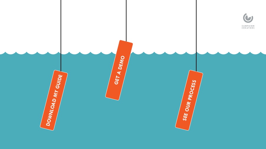
No conversion rate optimization strategy is complete without an element we can often take for granted: the call-to-action. The stats on the effects of CTAs are hard to argue with; whether on page, in a social post, or embedded in video, they have been proven to boost conversion rates by double-digit percentages!
Of course, designing an effective CTA takes work. Today, we will be providing a helping hand by going over some best practices for a call-to-action that will turn heads and speed up sales funnels.
A call-to-action is a piece of content intended to induce a viewer, reader, or listener to perform a specific action. They typically take the form of an instruction or directive but the range of potential actions a CTA may be created for varies greatly-- from signing up for a mailing list to downloading an ebook to reaching out to your company with a question about your products.
Essentially, you are giving the audience a gentle nudge in the right direction by specifying the action they should take next.
In digital marketing, CTAs will naturally also be presented digitally. This means that common opportunities to include a CTA will be:
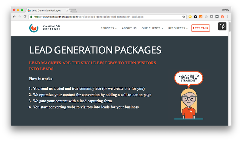
So what do calls-to-action look like? They can take the form of a banner, a button, or simply a piece of text that has been designed to stand out and catch the eye. Most often, they double as clickable links to take an interested viewer to a relevant page. Now let’s consider some features of a CTA, and how to make them work for you.
The physical design of a CTA is simply a vehicle for its most valuable component: the text. Wording should aim to interest, inform, and even potentially entertain the reader-- and all in the span of a few words! For this reason, the best types of words to include are action verbs. Some examples include:
The goal is to convey the value of the offer clearly and quickly to the viewer, so your choice of verb will naturally vary between whitepapers (“download” or “subscribe”) and eCommerce sales (“shop now”). If possible and relevant, also include simple key nouns to clarify what they will be receiving, such as “guide” or “discount.”
Use words that convey emotion and/or enthusiasm; something as simple as an exclamation mark can have a significant effect on conversions. Additionally, consider including numbers in your text. Testing has shown that customers respond well to specific figures in mentioning product costs and promotions because they psychologically prepare them for the amount they will need to spend while promoting the idea of transparency.
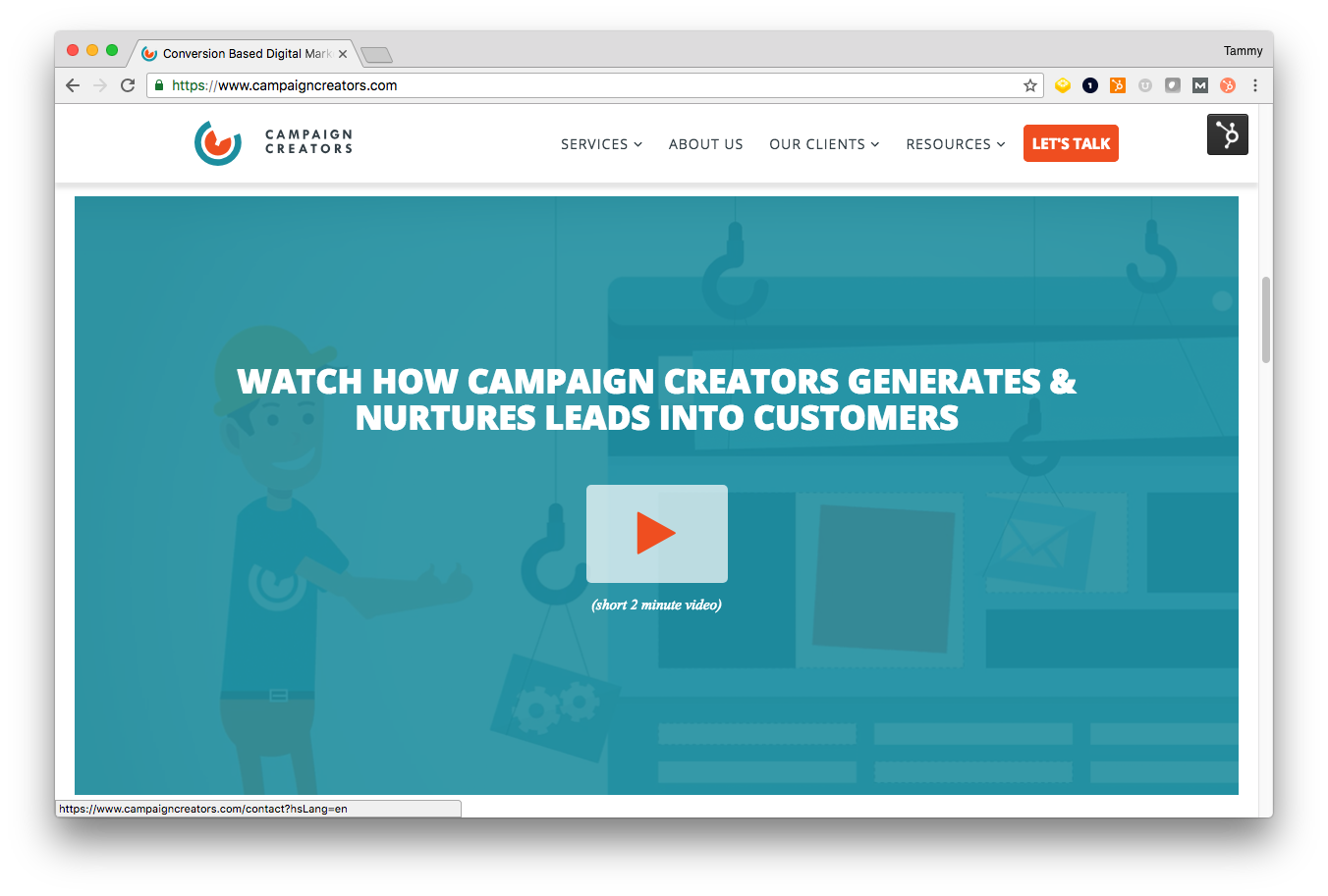
It goes without saying that your CTA should be large enough to read easily on both PC and mobile device. The size of an element on a page is directly proportional to its noticeability, so bigger generally is better; however, it’s important to avoid a button so large that it comes off as intimidating or obnoxious to look at. Additionally, if multiple CTAs are placed on a single page, hierarchy will need to be considered so the primary and secondary calls-to-action can be sized appropriately.
In the case of buttons, there are a few options for shapes available, the most popular choices being circles or rectangles (with straight or rounded corners). Generally, your company site’s overall design and page layouts should be taken into account.
Many marketers have theories about which shapes are most effective; for example, some believe that rounded corners point inward and draw the attention to the content of the CTA, and cater to our psychological aversion for sharp corners. Others suggest that clean-cut rectangles are simple and professional. This is one of many reasons why taking the time to test how tweaks to your CTA perform with viewers is worthwhile.
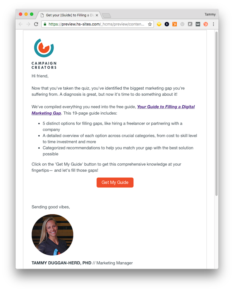
Color is another element which should depend on your site design, as contrasting colors provide for eye-catching CTAs. It may help to research a bit about color psychology, as different colors appeal to different audiences and inspire a variety of emotions. Don’t forget that CTAs should be surrounded by a healthy amount of white space, both to call attention to themselves and to avoid visually cluttering the page.
In general, it is advisable to keep calls to action above the “fold” of a page-- the first frame your visitors see-- to ensure they become visible to viewers early on, while their attention is still captured. However, this can depend on the nature of the material presented and the offer being made in the CTA.
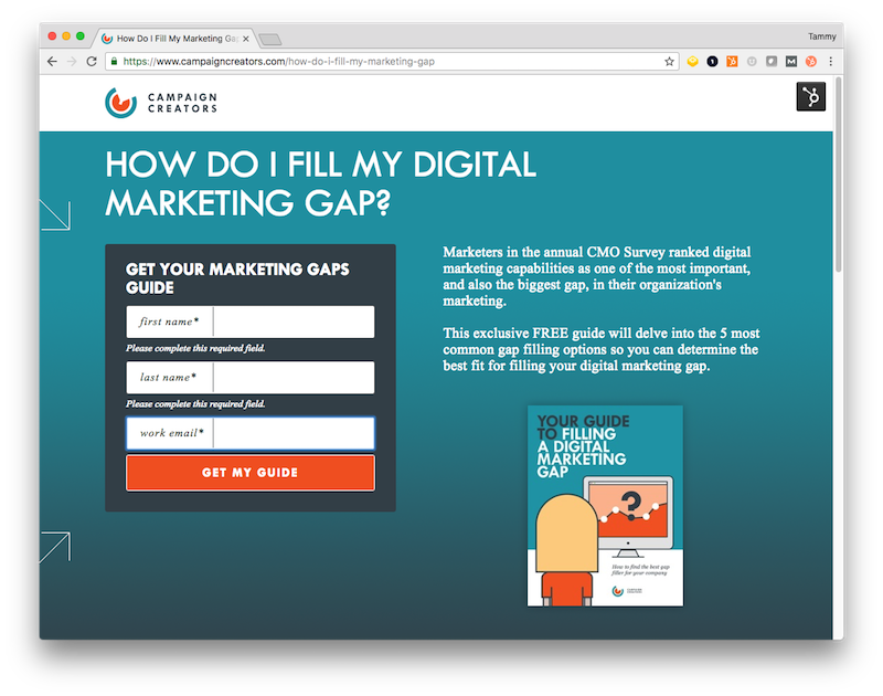
For example, if the CTA on a blog post asks the reader to submit personal information to subscribe to your mailing list, it is logical to first prove your value by letting them read a good portion of the post. To put it simply, use context and common sense when deciding where to place your banner or button.
Multiple CTAs can also be interspersed with similar, but not identical wording throughout different parts of one page. Consider the natural user experience your audience undergoes when reading-- left to right, and up to down. Call-to-action buttons placed towards the bottom or to the right of content have proven to attract the most attention in several tests.
Keep in mind that at the end of the day, the CTA’s design can only sell itself so much. The nature of the call to action-- the offer being made-- needs to be compelling, and what is asked of viewers in exchange should be reasonable. In establishing credibility, there can be a fine line between “too good to be true,” “steep demands,” and “just right.” Customers can easily become discouraged or annoyed by this; show them you value their time.
If personal data is requested, it should not be too private or involve extensive form fields. Minimize obligation on the audience’s end; trials and downloads are free, consultations are low-hassle, email subscriptions can be canceled easily. Finally, take advantage of FOMO in establishing that an offer is being made for a limited time, or the product being offered will yield immediate value to the customer.
Learning the theory is well and good, but the only tested way to optimize your CTAs is… well, testing! The test best suited for this is an A/B test, in which two versions of a CTA (or any element of your page) can be measured head-to-head to determine which has a higher capacity to convert customers. Ready to get started? Check out this article to learn more about A/B testing.
While a victory in and of itself, a CTA conversion is by no means the end of the road. The goal is to continue guiding customers all the way down the sales funnel, so it’s important to align calls to action with other parts of your marketing plan.
A good, well-planned flow is the key to getting the conversion rates you are looking for, and lead nurturing is the core of this. The Lead Nurturing Campaign Blueprint series can get you on your way to building a strong campaign for your B2B or eCommerce business.
Once they have clicked that CTA, make sure your landing page is optimized to convert them with our Ultimate Conversion Landing Page. This template will help you save time and drive conversions for all your offerings.

Calls to action (CTAs) are the linchpins of successful inbound marketing campaigns. They are not just buttons or phrases; they are strategic tools...
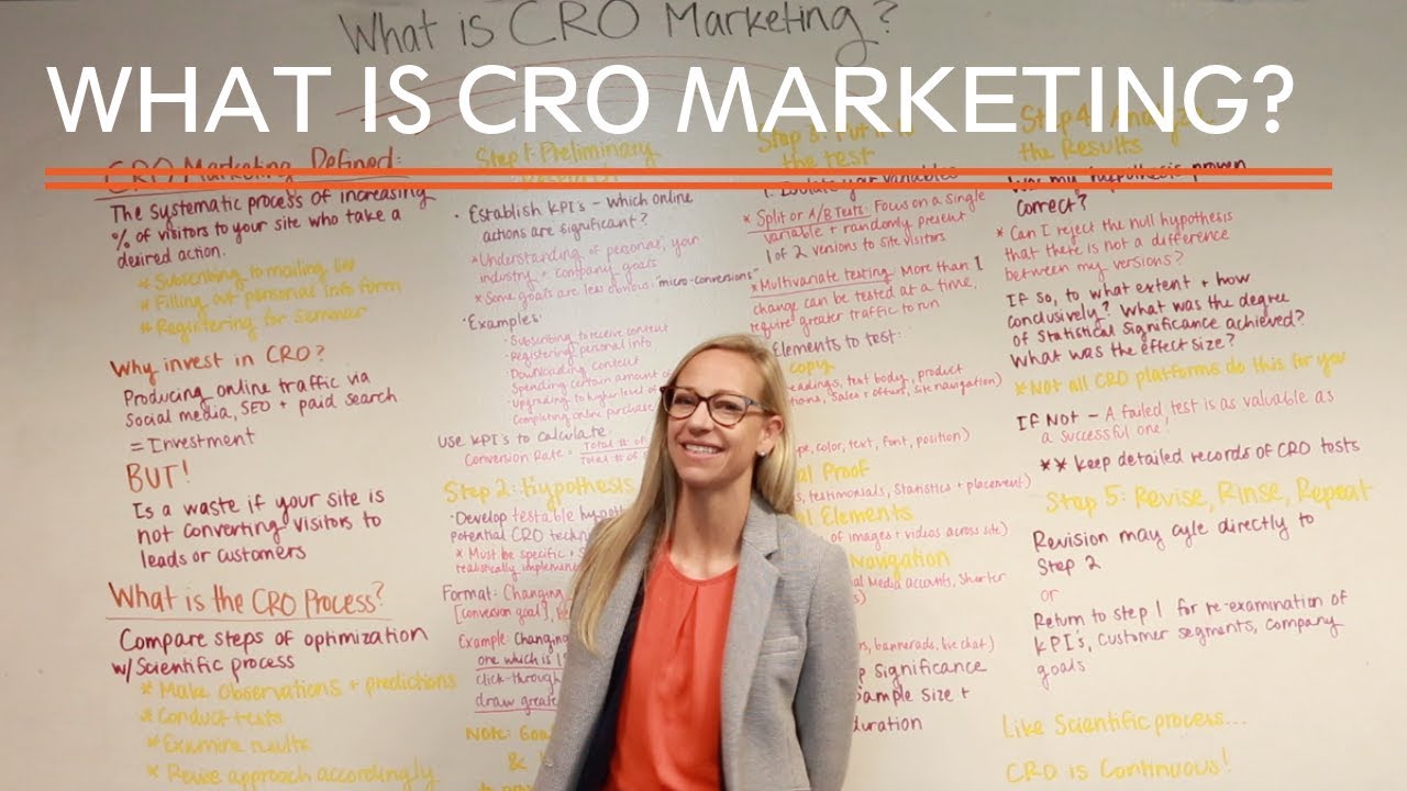
Producing online traffic via social media, SEO, and even paid search is a great start for a marketing strategy, but certainly not a guarantee that...

In this [video] learn an easy way to improve the conversion rates of your blog call-to-actions.