How to Apply Growth-Driven Design to Your Marketing
While Growth-Driven Design is primarily thought of in the context of website design, its principles can and should be applied to all your marketing...
Hey Campaign Creators, Tammy here, Market Research Analyst at Campaign Creators. Today, I want to help you answer the question, “Are my conversion rates good?” This is a very important question to answer, both in terms of reporting to your key stakeholders, and in helping you determine if you need to makes changes in order to optimize what you are doing.
This blog post is part of “Your Definitive Guide to Lead Generation” blog series.
Now the first thing that we need to know is what are we comparing our rates to? There’s a couple of options here. Do we want to know are our conversion rates good in comparison to…
And you don't have to choose only one of these benchmarks to use as a comparison. In fact I suggest comparing your observed rates to all benchmarks you have available in order to get the fullest picture of your performance and make the most informed decisions possible.
For example, maybe your conversion rates are significantly better compared to industry averages but are worse than your company has seen in the past. You may decide that this second piece of information indicates room for improvement – a determination we would not have made if we only compared our rates to industry averages.
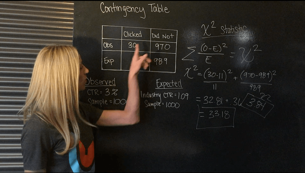
Once we have decided what we are comparing our rates to, we want to know if we the rate were significantly better (or worse) than those benchmarks. Now how do we do that? Enter the chi-square goodness of fit test. Now what this test tells us is if our what we observed was significantly different than what we would expect if we performed in line with our comparison benchmark. To conduct this test we first must to fill out a “contingency” table like the one here:
|
Clicked through |
Did not click through |
|
|
Observed |
||
|
Expected |
There are two sets of numbers in a contingency table. We have Our observed frequencies and our expected frequencies. Our, expected frequencies are as you would expect, the conversion rates we actually observed. And our expected frequencies are the frequencies we would expect if we performed in line with our comparison benchmark.
Let’s walk through completing this contingency table with a real example. Let’s say I sent out an email for a client in the It space to 1000 recipients. I want to know if the click through ratio of this email is good in comparison to industry averages.
We start with finding our “observed” frequencies. In this case, how many people clicked through our email and how many did not. If I sent the email out to 1000 people, and had a click through ratio of 3%, that means 30 people clicked through (3% of 1000) and 970 people did not (97% of 1000). So my observed frequencies are 30 and 970.
|
Clicked through |
Did not click through |
|
|
Observed |
30 |
970 |
|
Expected |
Now we need our “expected” frequencies. With a quick Google search for a trusted source I find the IT industry average click through ratio is 1.09%. I sent the email out to 1000 people, so if the email performed as expected (in line with industry averages), we would expect approximately 11 people to click through (1.09% of 1000) and 989 people not to (98.91% of 1000). So my observed frequencies are 11 and 989.
|
Clicked through |
Did not click through |
|
|
Observed |
30 |
970 |
|
Expected |
11 |
989 |
Now that our table is complete it is time to calculate our chi-square statistic. The formula for this is:
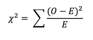
where O = observed frequency and E = expected frequency
So in our example
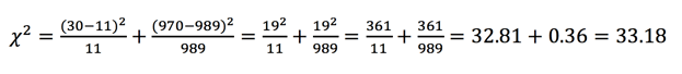
If you don't want to calculate this by hand you can use a free chi-square calculator tool like the one offered on graphpad.com.
Now what do we do this number? We compare it to a critical value. Our critical value when there are 2 possible response options (click through, not click through) is 3.84. In fact whenever we are talking about conversion rates the critical value will be 3.84 with a p value of .05. You’ll have to tune in later in this series where we talk about sample size and probabilities. But for now, you’ll just have to trust me.
So is our click through ratio for this email better than the industry average?
Drum roll please:
Yes! Our calculated chi-square of 33.83 is way bigger than 3.84, which means our click through ratio is statistically significantly different than the industry standard. but is it better or worse? Well let’s look back at our contingency table. We had 30 people click through which is greater than the 11 expected. So we did in fact perform significantly better than industry averages. This is good news to report to my stakeholders and I will also let my team know that we should spend time optimizing another piece of our campaign or website rather than this email because it seems to be doing a pretty good job, at least in terms of industry standards.
Thanks for joining me and nerding out with some statistics for digital marketing. Be sure to check out the next vlog in our series where we cover A/B testing. Download this free guide for 30 more lead gen tips, tricks, and ideas to boost your business.


While Growth-Driven Design is primarily thought of in the context of website design, its principles can and should be applied to all your marketing...
Welcome to Part 2 in our series on Email Testing. In Part 1 of our series, we covered the top 3 things you should be testing and optimizing:
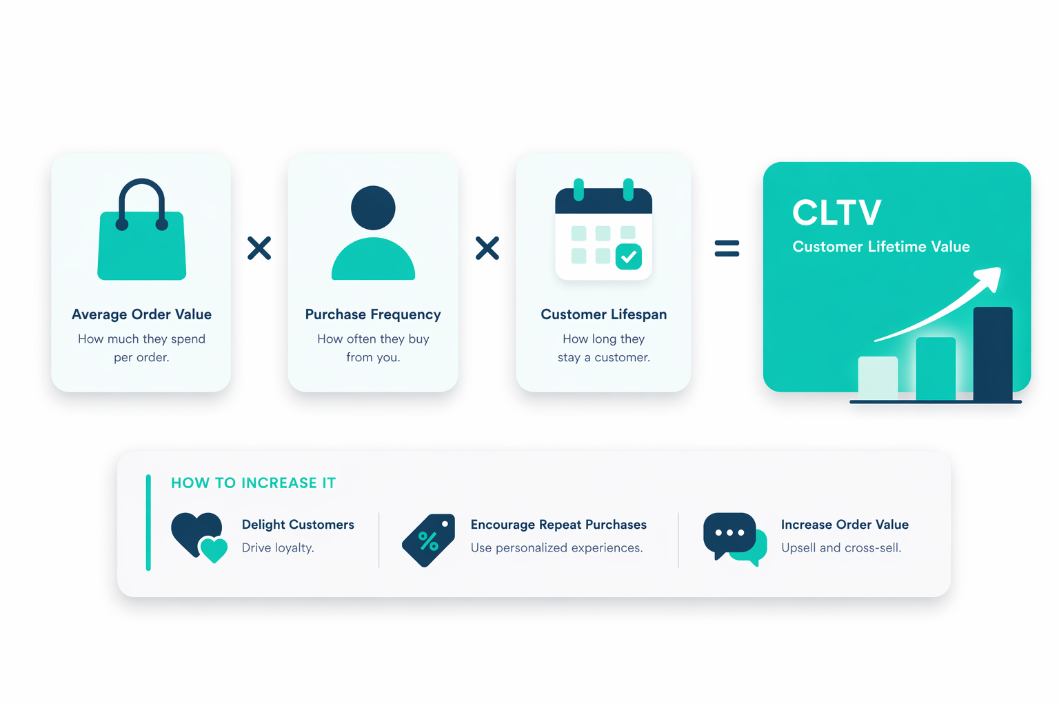
Customer Lifetime Value (CLTV) shifts your focus from one-off sales to the full value each customer brings over time. Instead of relying on single...