 Campaign Creators

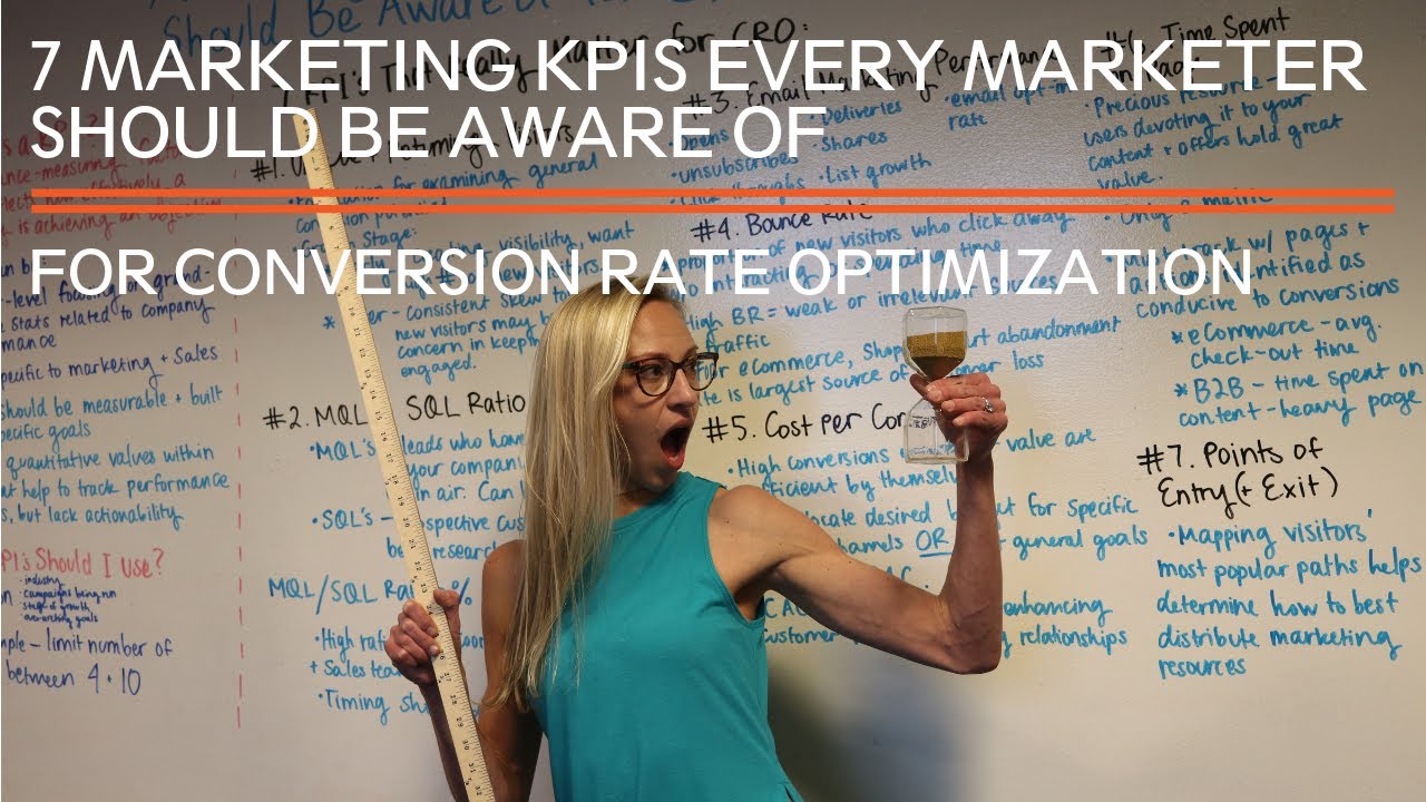
7 Marketing KPIs to be Aware of for Conversion Rate Optimization
Testing in marketing strategy is about getting the right answers, and the right answers require the right questions to be asked. The gap between...
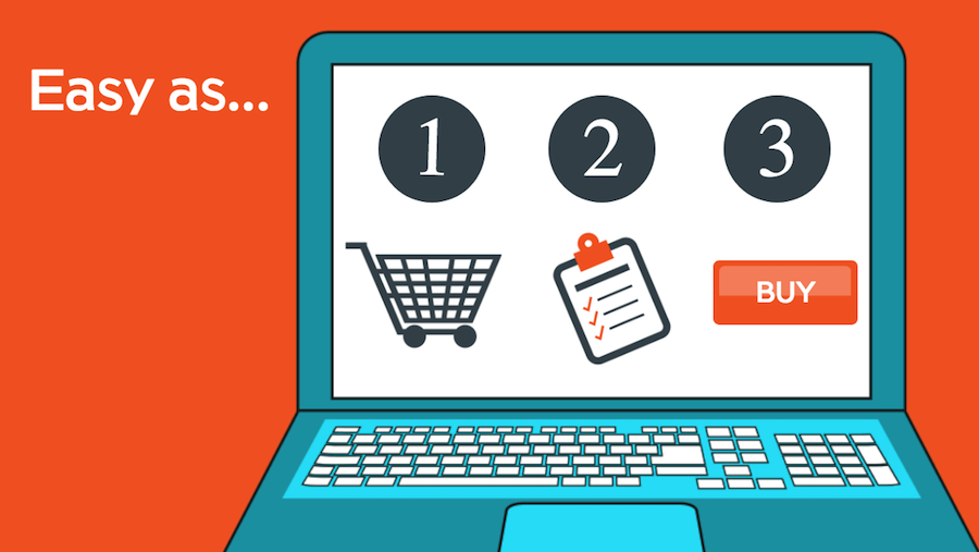
Your visitor has found your eCommerce site, selected a product and placed it in their cart. But until they enter their payment info and click the last purchase button, no sale is final! To assure they carry through with the purchase, you need to optimize your eCommerce marketing. Part of that means making sure the checkout process as streamlined and efficient as possible. If you leave even the smallest hurdle, your potential customer could abandon the sale and look elsewhere.
To make sure that doesn't happen, we're laying out the best practices for a checkout experience sure to increase your conversion rate.
For those who prefer to watch rather than read...
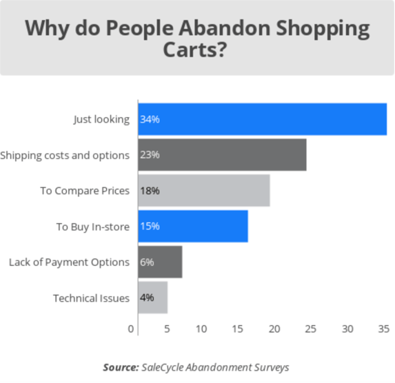
On average, all sectors of online stores have a 76.9% abandonment rate. Even with the most efficient online checkout process, your store runs a high risk of shoppers leaving before they make a purchase, so eliminating the potential of losing a customer due to a poorly designed checkout process would help minimize the chance of abandonment. Some reasons people abandon their cart, aside from not being ready to buy, are:
To identify what your site might be doing to instigate a disinterested shopper, ask yourself:
The more your site can eliminate these issues, the only problem you face is the shopper not being ready to buy. Luckily, that’s where your digital marketing campaigns and strategies come in!
With conversion rates often being used as a major KPI to determine the effectiveness of eCommerce sites, the question at the top of many marketers’ minds is whether their site conversion rates are up to par. In reality, average rates vary considerably by a number of factors, including:
According to Invesp, the average conversion rate for eCommerce websites in the U.S. is 2.63%. Online-only retailers tend to see higher rates than their multichannel counterparts, and mobile conversions are steadily growing by the year, though users are still 164% more likely to convert on desktop. Unfortunately, measuring the contribution of offline and cross-device conversions is currently very difficult, so these can go unaccounted for in the calculated averages.
That being said, it is normal to see some variation in rates among eCommerce companies. If your company’s numbers fall somewhere in the range listed above, it may be better to focus on consistent improvement rather than attempting to beat statistics which, while backed by data, are far from infallible. We will be doing just that today by exploring best practices for your website’s all-important checkout pages. So let’s get started!
As a multi-step process, checkout can easily become intimidating for impatient and less experienced shoppers. The best way to avoid deterring conversions is to streamline the flow of checkout by structuring your page intuitively.
It may seem tempting to incentivize visitors to become registered site members, but a checkout page is not the place to do it! According to Automate.io, 25.6% of online consumers would abandon a purchase if they were forced to register first. Registration requires commitment, both psychologically and time-wise, and is intimidating to users who have mentally prepared themselves to complete their purchase.
As such, guest checkout is a crucial component of an effective checkout page. A minimum of two paths, for guests and non-guests, is necessary. As one of the leading causes of abandoned shopping carts, account login must be suggested rather than forced in order to enable customers to give away personal data without feeling pressured to compromise their privacy.
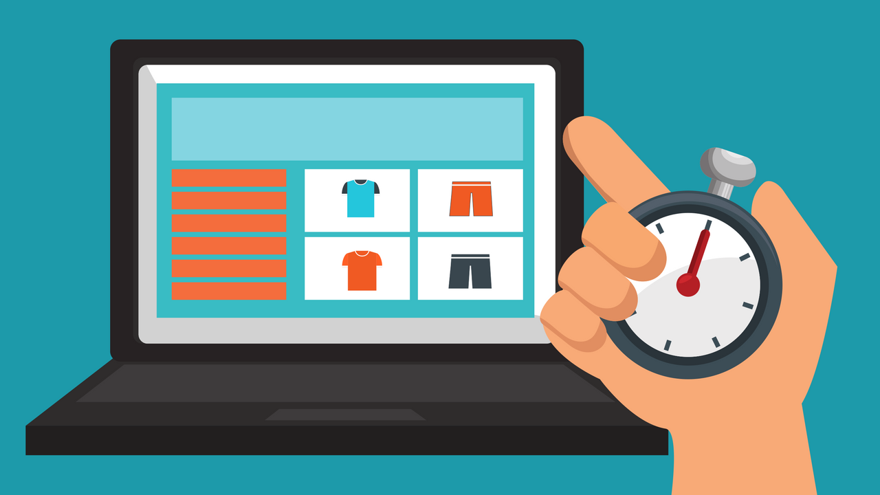
This applies to the general optimization of your eCommerce site, but checkout is no exception—speed matters. According to HubSpot, every second of loading time correlates with a 7% decrease in conversions. Consider running speed tests on your page with the help of tools like Google’s PageSpeed Insights. This tool will not only identify where there are errors, but also outline how to technically fix those errors.
When it comes to lowering loading time, your strategy will go hand-in-hand with best practices for the design of your checkout page–clunkier, more data-heavy elements on a page should be primary targets to eliminate, as well as unused plugins and limited site-wide tools. Especially if your page has many images or graphics, apply lazy loading to your images and also minimize the file size of unnecessarily large images. A tool we like to use to easily compress an image’s file size without compromising the quality is TinyPNG.
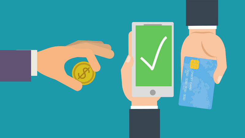
A small, but increasingly significant element for eCommerce shoppers is being granted choices in their methods of online payment. Many stores are now offering options like payment after delivery, numerous credit providers, and split payments.
Commonly used payment methods include Paypal, Google Pay, American Express, and others. Digital wallets, such as Apple Pay and Amazon Pay (more than 20% of customers are choosing Amazon Pay over other options!), are popular especially with mobile shoppers.
Offering a variety of payment options to shoppers is recommended at first because people are often concerned about sharing sensitive information online, like their credit card number. Many people won’t pay if the payment option they trust isn’t available. Keep in mind that providing too many payment options can have a negative effect. So, we suggest testing for which payment methods are used most often through your site, and later only making those available.
More pages or stages of the checkout process create more hoops for customers to jump through, and each one reduces the chance that they will complete their transaction. For this reason, it’s best to reduce the number of steps in your checkout as much as possible.
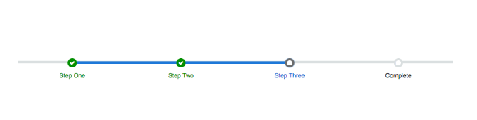
Guiding customers, especially those who aren’t well versed in buying online, is considerably easier with progress tracking. A progress indicator, which keeps the customer updated on their position in the process and provides a time estimate, is a great addition to the page. You can build a progress indicator that looks similar to this:
Additionally, it is better user experience to keep customers on your site domain through the entirety of completing their purchase. Some websites redirect to third-party providers, but this can create a distracting element for the user. While this can seem secure from a technical standpoint, being redirected to an external and unfamiliar domain may outweigh the benefits.
Let shoppers save a wishlist
As stated in the SalesCycle Chart above, most online shoppers are “just looking,” or do not intend on making a purchase when they first land on your eCommerce shop. Instead, many prefer to create wishlists or save their digital carts for later.
Offering wishlists is an effective way to reduce shopping cart abandonment for customers who display intent but require more time to follow through. Even if the visitor isn’t signed in, it is possible to save their data for future access.
There are a number of ways to optimize your wish list—Most importantly, make sure your wishlist is simple. Shoppers should be able to easily place items in their wishlist, access their saved wishlist, and purchase the items saved in just a few clicks. We suggest using their saved data to your advantage by pushing deals and sales that will drive them to purchase sooner. Lastly, be sure to test the effectiveness of your wishlist in order to solidify what works best for your customer demographic.
Every section of your website is a reflection of the company, and appearances do make a big impression, even on the way out. There are several general design principles to keep in mind when creating your page.
As mentioned above, keeping things simple in terms of the organization and layout of a checkout page can boost your conversion rates. Use common-sense principles such as visual hierarchy and white space to make the page easy on the the eyes. This helps direct customers to perform desired actions.
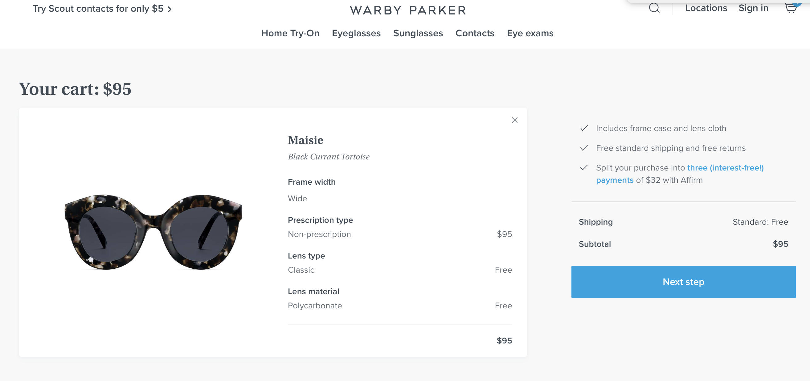
The call-to-action (CTA) in particular, and page copy in general, should be clear. The checkout process may not require extensive amounts of copy, but there is still some opportunity to make it count; particularly in purchase instructions, product information, and form labels. With regards to labels, it is better to opt for standard form labels like “name” and “address” instead of trying to be unique at the risk of coming off as gimmicky or unprofessional. Warby Parker has a great checkout page design that exemplifies the "less is more" look:
One of the primary complaints of online shoppers entails being misled about the final cost of their purchases, especially when they have invested time into filling out data forms. The solution is simple: include all costs up front, whether on the product page or in a section of the checkout page.
Shipping costs can be a major deterrent to buyers. Some companies offer free shipping unconditionally; others match it with certain promotions or special conditions. With 50% of eCommerce merchants offering free shipping to customers, this is an ideal conversion strategy.
Understandably, however, your company may not be ready for such a drastic measure. Keep in mind that there are other alternatives, such as including flat shipping fees, price thresholds, seasonal promotions, and customer memberships.
It is no secret that mobile is continuing to grow as a platform for eCommerce shopping. In fact, 62% of smartphone users have made a purchase online using their mobile device in 2019. While mobile conversion rates are considerably lower than desktop, it can still be worthwhile to make your checkout compatible with mobile devices with straightforward layout.
This is also another reason to feature a “Save for Later” or “Add to Wishlist” button on your site—users may not feel comfortable completing the actual purchase on their phone, but can save their results to review later on a more secure device, like their computer.
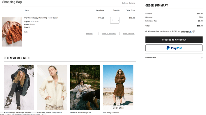
Checkout may not seem like the time to make a sale, but if handled well, it can in fact provide opportunities to upsell or cross-sell products. The strategy for recommending related products will vary by industry, but you will find there is almost always a way to leverage the purchase. Urban Outfitters is a great example for a company that utilizes this strategy by offering other clothing items that are "often viewed with" the clothing item that was placed in their shopping cart.
Another potential place to position an upsell offer is the thank you page, which is recommended to include both as a business practice and courtesy to your customers. Regardless of where you implement it, cross-selling and up-selling are strategies proven to be effective.
At the end of the day, the primary way of discovering which tactics and elements make your checkout page most effective at converting is to apply A/B testing. This will help you evaluate all of those elements you may feel unsure or curious about. Don’t be afraid to take risks and determine what truly fits your company’s needs best!
If you want to learn more about A/B testing, check out this blog.
Trust in eCommerce is substantially different from what is required of a brick-and-mortar company. Without a location or brand to physically interact with, even tech-savvy shoppers can feel nervous about entrusting their time and money to a multitude of intangible variables seemingly out of their control. Gaining customer trust, therefore, requires playing by some new rules. It will shape both long-term and immediate relationships between sellers and buyers-- completion of purchases, repeat sales, promotion on and offline alike, and everything in between.
The bottom line in building trust is transparency. It's important to be honest and informative on your website and in all communications. To ensure shoppers can trust you, don't be shy about putting trust markers on display: Seals, logos, and badges are all easily addable elements of pages on your site, which can give your credibility with visitors a significant boost.
Design your checkout page to plan for experiences, not transactions. It can be tempting to add marketing value to your links by driving traffic to your general website rather than a specific product page, or adding pop-up ads to your most popular pages. However, customers can see through, and easily be put off by, an overwhelming “salesman” strategy that doesn’t put them first. Your eCommerce site is selling an experience, after all, not just your products.
Lastly, don't forget to engage with visitors on an emotional level. A professional tone in product copy is undoubtedly important. However, this does not mean that there is no room on your site, much less outside of it, to establish a voice from behind the keyboard. Brand storytelling is a strategy with great untapped potential, and can be utilized everywhere throughout a site in small ways.
Optimizing your checkout page is a great first step, but let's be real, it's not the only way to improve your online conversions.
If you're interesting in learning how to implement an effective eCommerce conversion rate optimization (CRO) process that drives sustainable, download your free guide today. You'll learn how to implement an eCommerce CRO process in 8 easy steps.
Our process has helped an indoor trampoline park increase their eCommerce conversions by 227% in just 5 months. If they can do it, so can you.

Testing in marketing strategy is about getting the right answers, and the right answers require the right questions to be asked. The gap between...
Producing online traffic via social media, SEO, and even paid search is a great start for a marketing strategy, but certainly not a guarantee that...
Converting visitors on your mobile webpage into customers can be a challenging process. In fact, mobile conversion rate optimization is one of the...