 Campaign Creators
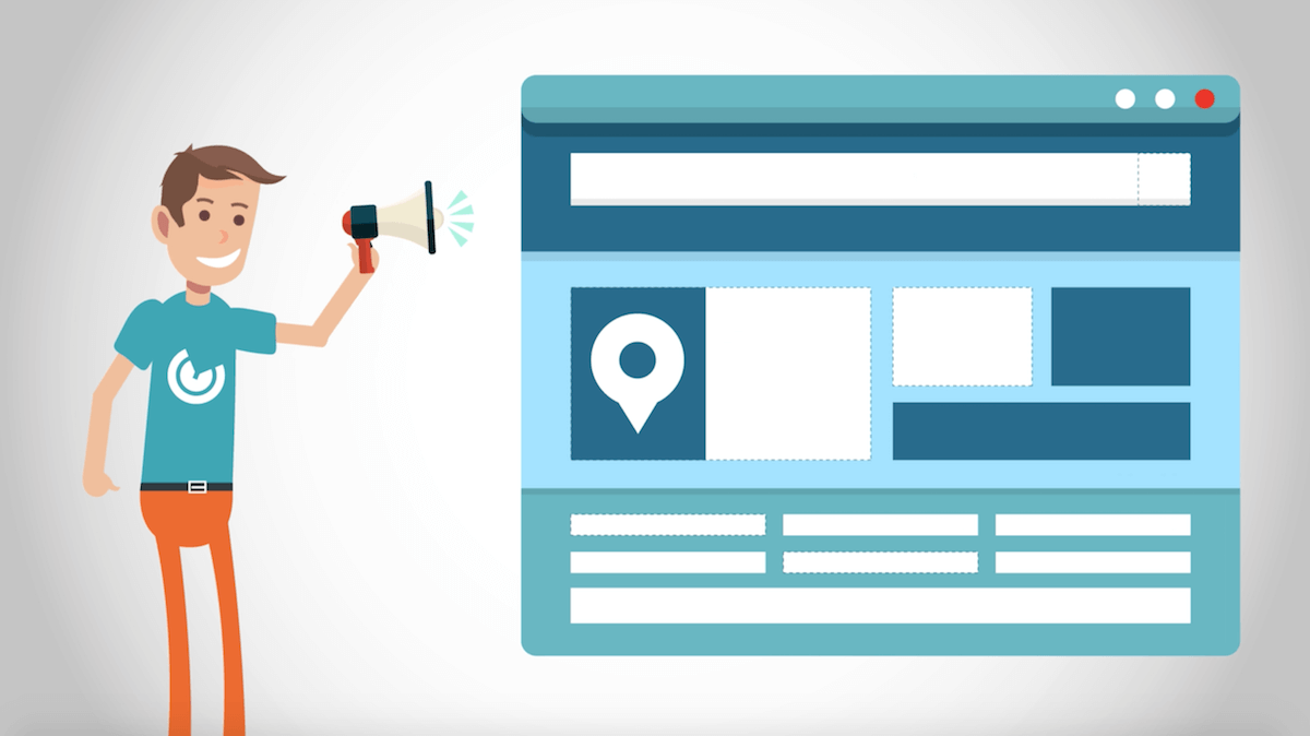
5 Powerful Reasons to Leverage Video Testimonials on Landing Pages
When you make a video of yourself or one of your employees talking about how great your products and services are, that's called selling. But when...
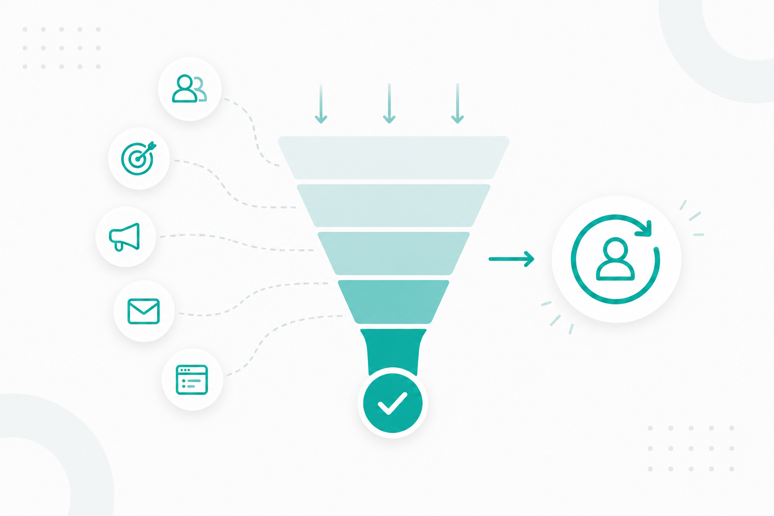
In the world of inbound marketing, lead generation is top of mind for plenty of digital marketers. Marketing specialists work tirelessly to create e-books, white pages, webinars, and infographics that provide tried and true solutions to their target audience's pain points. The challenge is convincing visitors to give you their email for your content. It all begins by creating a landing page that converts users and moves them down your marketing funnel. So where do you begin with optimizing your landing pages to convert visitors? Here’s a few ways you can do this.
Landing pages are powerful lead generation tools and online destinations that turn traffic into marketable contacts in your database. Unlike other pages, they are unique because they force readers to focus on one thing and one thing only—the conversion action you want them to take.
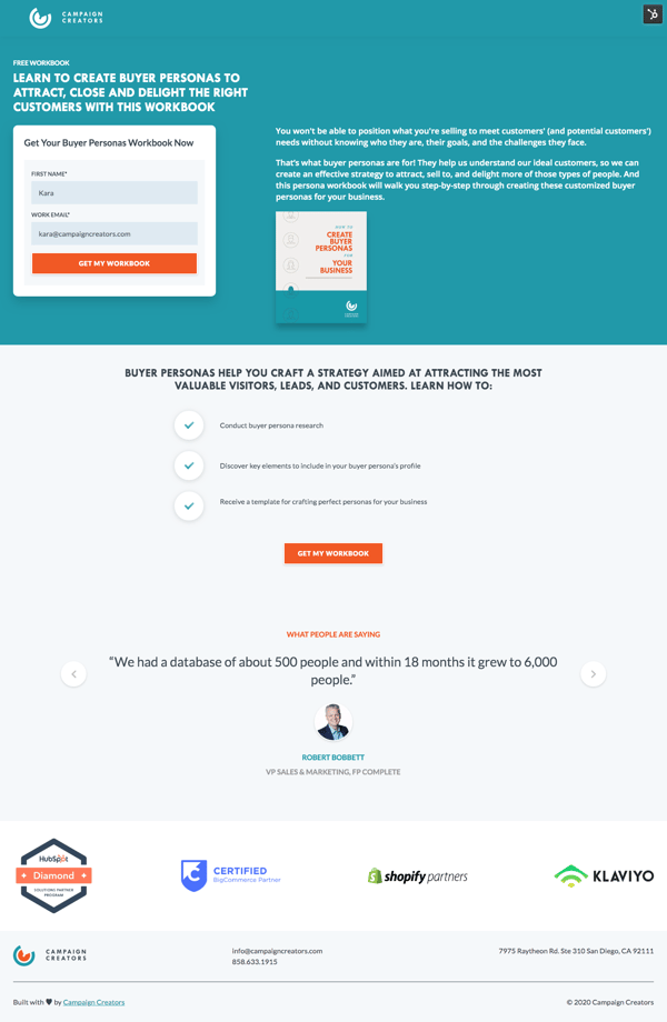
You can create a landing page to offer a new lead magnet, to register users for an upcoming webinar, or to get interested prospects to book a meeting with you. Here is an example landing page we created to offer a free buyer persona workbook. It includes the details of the offer, an image, what they'll learn, and a form to fill out their name and email to get the workbook.
The first landing page you create will most likely not be the final draft. Chances are you'll need to make incremental changes to see what converts a user down your marketing funnel and what doesn't. A complete page overhaul will only lead to confusion and stress. In the meantime, here are some key practices to optimize your landing pages for conversions.
Many businesses make the mistake of overselling the main features of their offer rather than its benefits to the customer. Doing so is less powerful and will likely turn the customer away. Your landing page should focus on what the offer is, but more importantly, why someone should want it.
Here are some examples that highlight features vs. benefits:
Here is another example of a landing page that focuses on the benefits of an offering from Moz:
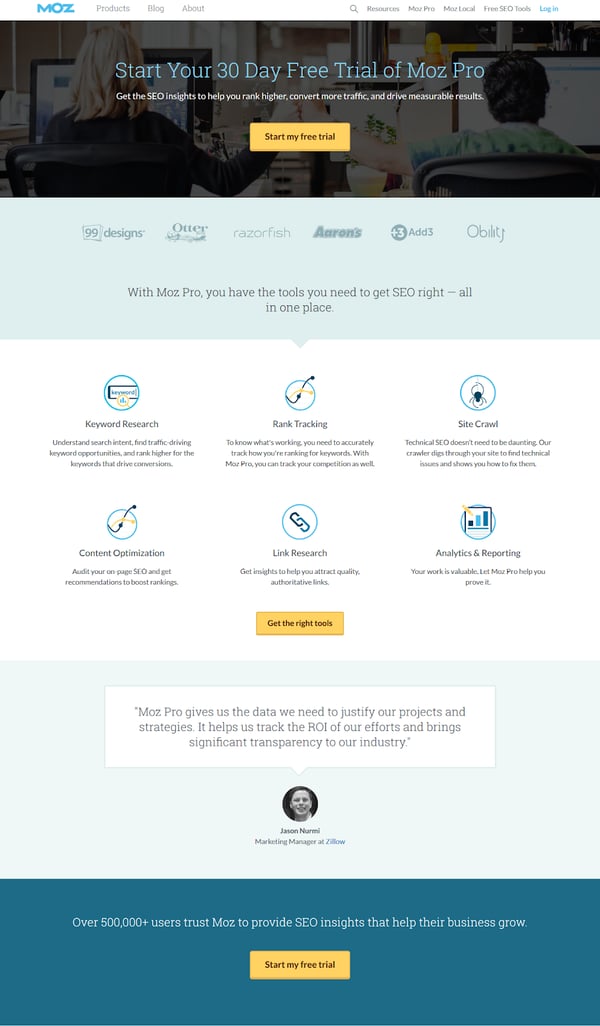
Source: Moz
This landing page doesn’t simply list the tools provided in the free trial, it helps potential leads identify specific benefits that can be expected from signing up. They have highlighted benefits such as understanding the searcher’s intent, finding technical issues to fix, accurately tracking keyword rankings, and more.
Customers are more likely to remember and respond to information that personally benefits them, and your landing page is the final push to remind them why they should invest in your offering.
A highly effective headline is crucial to conversion. People don't read a landing page word for word, so it's imperative to hook them on the first thing they see. Using simple, conversational words is far more relatable and engaging than formal business jargon that may turn customers away. Avoid convoluted language and be authentic—just speak to the visitor like they were a friend or colleague.
Make sure it clearly communicates your offer's unique value proposition—what exactly the offer is and why they should care. Here is an example from HubSpot:
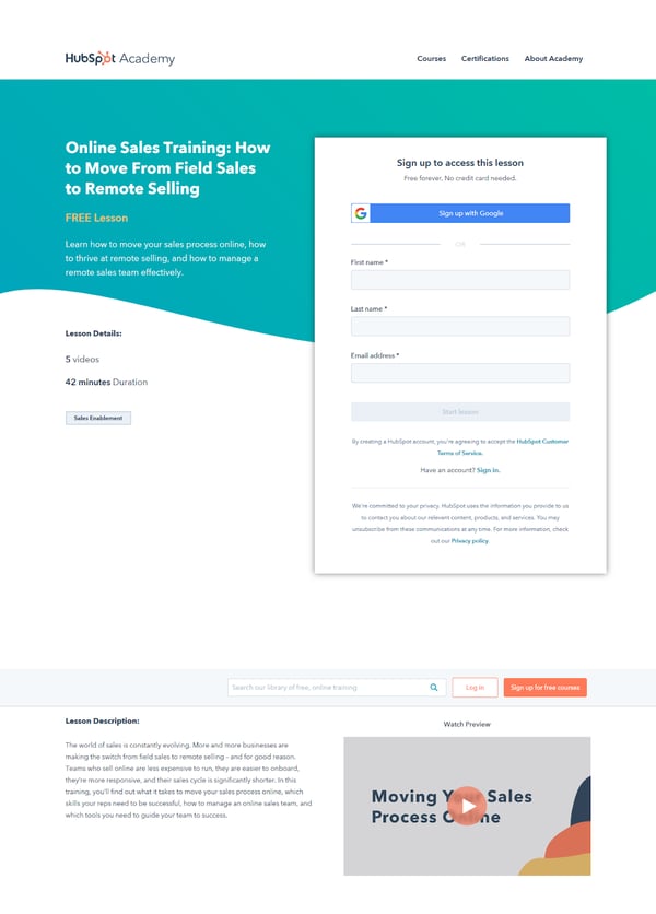
Source: HubSpot
This landing page quickly delivers the unique value proposition of the offer without using any acronyms or advanced sales jargon that could otherwise intimidate a potential lead. By making the headline and copy of this landing page more conversational, it invites visitors to sign-up without any hesitation.
In order for a potential lead to interact with you and turn over their email, they first have to trust you and your expertise. People want to feel safe and confident in their decision to download or register for something. But how do you establish trust in the limited space available for copy on a landing page?
This can be done through social proof, testimonials, endorsements and partnerships, and site seals (trust badges).
Provide social proof by displaying the amount of downloads of your asset or even the number of registrations for your event. Because others are already converting on your page, this will convince visitors to convert too. You can also show customers who have purchased your product. Showing real names is another way you can show visitors proof that real people are taking your offer.
A customer testimonial goes a long way when building trust with visitors. But make sure they are real! If you make up over-enthusiastic statements by using characters from stock photo sites or celebrity testimonials, you will come across as inauthentic. Here, the commoner thrives.
Try getting quotes from previous users of the product and provide a photo image and name. This legitimizes your product without giving off the “he’s trying way too hard” vibe. Celebrities get paid to promote. Normal people don’t. This adds to the authenticity of the element. Here is an example from Khan Academy:
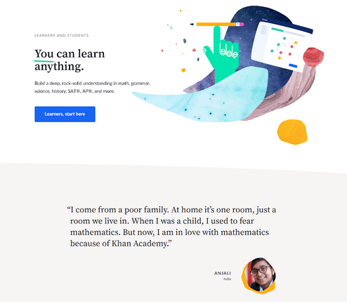
Source: Khan Academy
By including quotes and testimonials with a photo, Khan Academy is able to build trust and establish authenticity. These testimonials allow potential leads to follow a separate narrative that supports and serves as evidence to your claims.
Images have the power to present information in a more evocative and effective way than words can. Especially with images of people, consumers immediately insert themselves in the image in their mind. They analyze face and body language to get a sense for how this offering will make them feel.
Need help collecting testimonials? Check out our Post-Purchase Review Campaign for HubSpot-Shopify.
If you have affiliations with trusted people in your field or industry, include them to build your credibility.
This is a classic technique to garner trust. If you have associations or partnerships with trusted companies in your space that are relevant and well-known then display them. This is particularly important if you are asking for payment or identity information.
According to a study done by Baymard, 18% of consumers abandoned a checkout process due to not trusting a site with personal information. To help build trust, websites collect and display a broad range of site seals that suggest credibility. There are 3 categories of site seals:
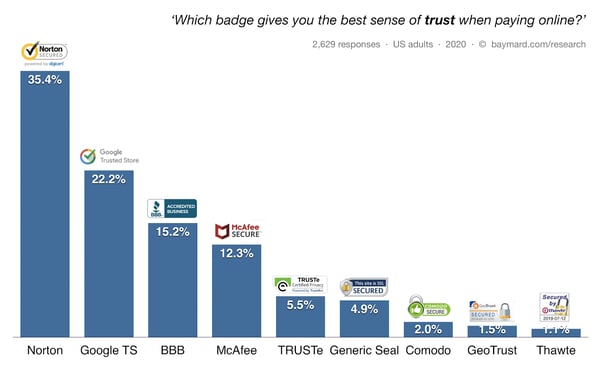
Source: Baymard
Among these different site seals, better known brands such as Norton and Google performed better than less recognizable brands. However, Baymard found that having any kind of visual seal within a close proximity of the CTA or form will reinforce a sense of security and trust.
Often visitors don't convert due to cognitive friction — basically they think too much, wait too long, or simply don’t respond to our calls-to-action. You can eliminate delays by creating a sense of urgency for your visitors to act sooner (on this visit) rather than later (another time).
According to the Academy of Marketing Science, product scarcity attracts a customer’s attention and increases the perceived value of the product. Availability might be threatened by limited quantity, a time deadline, or by competition. In turn, when we believe something to be higher value—we want it more. You can tap into this bias by limiting the number of the items available (“Only 2 Spots Left), the time left to act (“Special pricing ends tomorrow”), or mentioning the competition (“If you don't act, they will”).
You can create urgency and scarcity using the following tactics:
If you remind users that time is passing—that the clock is ticking—it raises the urgency level and compels action. This tactic also taps into the time aspect of the scarcity principle.
Loss aversion is our tendency to avoid losing things (anything). Many studies have actually shown that the desire not to lose something is greater than the desire to gain something. You tap into this tendency by stating what will happen if the visitor doesn't act now. For example, “If you don't read this email marketing guide, your mailing list will shrink from unsubscribes.”
Figure out what your desired landing page action is and reinforce it numerous times with your CTA in your button, supporting copy, headings, and form title.
You also want to be as specific as possible about the action you want the user to take. For example, use “Sign Up for Trial” rather than simply “Sign Up”, or “Download Guide” rather than just “Download”. Other affective CTA's are Watch Video, Download Guide, Register for Course, and Schedule Consultation. You should also add visual and directional cues towards your desired action, removing obstacles and distractions from completing the action desired. For example, you should remove your website menu items or any site wide pop-ups. These can steer your visitor away from completing your desired action and ultimately converting.
Remember, your main goal on a landing page is to guide visitors into taking a desired action––whether it be signing up for an email list, downloading a guide, or registering for an event.
So how can you create a seamless landing page experience that does just that? Here are 3 additional tips that will help you generate higher conversion rates:
A landing page is a crucial element for companies because it drives visitors to focus on the desired conversion action. Creating an effective landing page will give you a higher chance of converting visitors into leads and ultimately giving you more names in your database.
Get started on building landing pages that will drive conversions by grabbing our free Ultimate Conversion Landing Page Template for HubSpot.


When you make a video of yourself or one of your employees talking about how great your products and services are, that's called selling. But when...

In this hack, Sean shows viewers how to prioritize all the possible conversion rate optimization improvements you could make to your landing page or...
Marketing conversion has become more important as digital competition increases and customer attention spans continue to shrink. Research shows the...