Mobile devices have solidified their dominance, accounting for approximately 60% of all global web traffic. However, a persistent mobile gap remains: while desktop conversion rates average around 4.3%, mobile rates often lag significantly at just 2.2%. This discrepancy highlights a massive lost revenue opportunity, as mobile users are frequently forced to navigate sites that were designed for desktop first and then merely "shrunk down" for smaller screens, leading to high levels of interaction friction.
To bridge this gap, businesses must implement a mobile conversion optimization that focuses on identifying and eliminating specific conversion leaks, such as slow load speeds, intrusive pop-ups, and complex forms, to create a seamless journey from discovery to purchase.
This guide explores 12 proven strategies to help you refine your mobile experience, increase your conversion rates, and transform distracted browsers into loyal customers.
What Is Mobile Conversion Optimization?
Mobile conversion optimization (CRO) is a systematic process of enhancing a mobile website or application to increase the percentage of visitors who complete a desired action. While often associated with making a purchase, these conversions also include signing up for a newsletter, submitting a lead generation form, downloading a resource, or clicking on a specific link.
It is a common misconception that mobile CRO is simply a matter of shrinking a desktop site to fit a smaller screen. In reality, it is a distinct practice because user behavior on mobile is fundamentally different. Mobile users typically interact with content in shorter, more frequent bursts and are often in more distracted environments compared to desktop users. Furthermore, mobile users navigate using their thumbs rather than a mouse, which radically changes what constitutes a usable interface.
The process involves fine-tuning various elements, including design, layout, and technical functionality, to ensure the experience is as seamless as possible. This includes:
- Optimizing page load speeds to prevent users from navigating away in frustration.
- Simplifying navigation and forms to account for smaller screen real estate and "fat-finger" syndrome.
- Applying mobile-first design principles, such as placing critical buttons in the "thumb zone."
Mobile conversion optimization is about understanding the psychology behind why users browse versus why they buy.
5 Reasons Why Mobile Conversion Rates Are Lower
1. The "Browse on Mobile, Buy on Desktop" Habit
One of the primary reasons for lower mobile conversion is that users often treat their phones as discovery tools rather than purchasing portals. Mobile users tend to browse in short, frequent bursts throughout the day. For example, during a commute or while waiting in line. This leads to higher intent for research but lower intent for immediate action.
Consequently, many users who start their journey on a smartphone will complete the purchase on a desktop at a later date.
2. The Physical Constraints of Small Screens
Mobile devices present a significant "screen size dilemma". On a three-inch screen, product images that would be striking on a monitor are reduced to tiny thumbnails, and detailed product descriptions become overwhelming "walls of text". This makes it difficult for shoppers to compare products or review their full order, which often causes doubt and leads to cart abandonment.
3. Increased Interaction Friction
Everything is physically harder to do on a mobile device:
- Difficult Data Entry: Typing personal information, 16-digit credit card numbers, and billing addresses on a small input field and keyboard is tedious and error-prone.
- "Fat Finger" Syndrome: Unlike the pixel-perfect accuracy of a mouse, touch navigation is imprecise. If buttons are too small or placed too close together, users frequently suffer from mis-taps, leading to rage clicks and immediate session abandonment.
- Convoluted Checkouts: Many businesses still use checkout processes built for desktop, forcing mobile users to battle through multiple screens, mandatory account creation, and excessive form fields.
4. The Critical Impact of Site Speed
Mobile users have an exceptionally low tolerance for latency. While a desktop user might wait five seconds for a page to load, 53% of mobile visitors will leave a site if it takes longer than three seconds. Studies show that even a mere one-second delay in page load time can reduce conversions by up to 7%.
5. Trust and Security Concerns
There is a psychological barrier to mobile shopping. Users often feel more vulnerable when entering sensitive payment details while in public spaces or on unpredictable mobile networks. Furthermore, security indicators like SSL padlocks and trust seals are often harder to see or confirm on mobile interfaces, reducing the user’s confidence in the safety of the transaction.
12 Mobile Conversion Optimization Strategies
To bridge the mobile gap and turn browsers into buyers, businesses must move beyond simple responsive design and implement mobile-specific interventions. Here are 12 proven strategies to boost your mobile conversion rates:
1. Prioritize Mobile-First Design
When you start with mobile, you naturally remove unnecessary elements that don’t support the main goal, which leads to a more focused and usable experience. Every section has to earn its place on a smaller screen, so navigation becomes simpler, content becomes easier to scan, and actions become more obvious.
A mobile-first approach also improves performance because you are building with speed and efficiency in mind from the start, rather than trying to fix performance issues later. As the experience scales up to larger screens, you can then layer in additional features without compromising usability.
2. Optimize Page Load Speed
Speed is the highest-ROI change you can make. Aim for a load time of under three seconds. Compress images so they load faster without sacrificing quality. Use a Content Delivery Network (CDN) to serve your site from servers closer to your visitors, which reduces delay. Eliminate or defer render-blocking JavaScript, so your pages can display content immediately instead of making users wait.
You can also minimize CSS and JavaScript files, enable browser caching, and reduce unnecessary plugins or scripts that slow things down.
3. Master the Thumb Zone
75% of mobile interactions are made with the thumb, but many sites place critical buttons in hard-to-reach top corners. Map your interface so that primary actions like "Add to Cart" or "Sign Up"live in the "natural" green zone at the bottom-center of the screen. Conversely, place destructive actions (like "Delete") in hard-to-reach "red zones" to prevent accidental taps.
4. Simplify Navigation to the Three-Tap Rule
Simplify navigation around the three-tap rule so users can move through your site with minimal effort, rather than getting stuck making decisions. You want someone to reach any core category in two taps and land on a specific product in three taps or fewer, which keeps the experience fast and intuitive on mobile. Keep your menu structure shallow, group items clearly, and avoid overloading users with too many choices at once.
A prominent search bar also plays a big role here. Place it where users expect it, such as centered or at the top right with a standard magnifying glass icon, so they can skip browsing entirely and go straight to what they need.
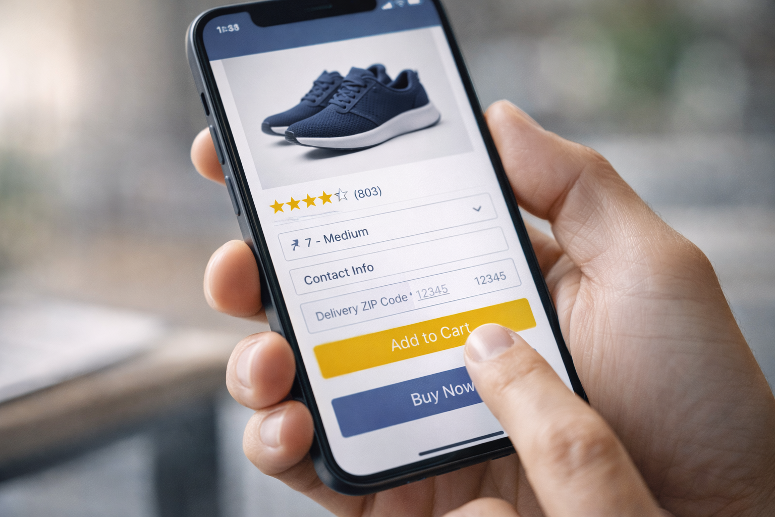
5. Streamline Forms for Small Screens
Long, complex forms are a major point of friction on mobile. Stick to a single-column layout to create a clear linear path and avoid confusing horizontal scrolling. Only ask for essential information; limiting forms to 5–6 fields can significantly improve completion rates.
6. Trigger Optimized Keyboards
Reduce typing effort by matching each form field with the correct input type. When a user taps a phone number field, the numeric keypad should automatically open. Likewise, an email field should display a keyboard with the "@" and ".com" symbols. These small adjustments prevent errors and user frustration.
7. Implement One-Click and Guest Checkout
Implement one-click and guest checkout to remove friction at the most sensitive stage of the buying process. When users are required to create an account before paying, many abandon their cart instead of completing the purchase. Let them check out as guests so they can complete the purchase faster, then offer account creation after the transaction if needed.
Adding digital wallets like Apple Pay, Google Pay, or PayPal also speeds things up since users don’t need to enter shipping and payment details manually. This approach mirrors what Amazon achieved with its one-click checkout, where reducing steps led to higher conversions and fewer drop-offs at checkout.
8. Use Sticky CTAs and Bottom Navigation
Since mobile users scroll quickly and often skim content, your primary call-to-action (CTA) should stay visible at all times to capture intent the moment it appears.
A sticky "Add to Cart" bar or a floating button anchored at the bottom of the screen keeps the action within easy thumb reach, reducing the need to scroll back up and lowering friction in the buying process. This makes it easier for users to act immediately, especially when they’re ready to purchase, and helps prevent missed opportunities that happen when CTAs disappear off-screen.
9. Personalize by Visitor Segment
Personalize your mobile experience based on who the visitor is and how they arrive, so each user sees content that feels relevant instead of generic.

A returning customer can be greeted with a simple “welcome back” message, along with recently viewed or frequently purchased items to make reordering easy, while a new visitor coming from a paid ad can be shown a first-purchase discount, clear value propositions, and strong social proof to build trust quickly.
You can set this up using basic segmentation rules in your analytics or e-commerce platform, track behavior like pages viewed, traffic source, and purchase history, then trigger different banners, product recommendations, or offers based on those signals. You can also use cookies or login data to recognize returning users, integrate your ad platform to align landing page messaging with the original ad, and run simple A/B tests to refine what each segment responds to over time.
10. Enhance Product Visuals and Zoom
Enhance your product visuals and zoom functionality so users can confidently evaluate what they’re buying without needing to see it in person. High-resolution images should load quickly and allow both pinch and double-tap zoom, giving users the ability to inspect details like texture, color, and fit.
Keep images in their original aspect ratio to avoid stretching or distortion, which can make products look misleading and reduce trust. You can also include multiple angles, close-up shots, and lifestyle images to provide better context, then optimize file sizes so quality stays high without slowing down your site.
11. Minimize Intrusive Pop-ups
Minimize intrusive pop-ups so you don’t disrupt the user experience the moment someone lands on your page. Full-screen interstitials that appear immediately often feel aggressive and lead to quick exits instead of engagement. If you still plan to use pop-ups, trigger them based on intent signals such as when a user has scrolled a meaningful portion of the page, spent a certain amount of time, or shown exit behavior.
Keep the size controlled, ideally no more than 15% of the screen, so content remains visible and usable, which also helps avoid potential Google search penalties. You can also test less disruptive formats like slide-ins or banners that appear gradually, making the interaction feel more natural rather than forced.
12. Run Mobile-Specific A/B Tests
Run mobile-specific A/B tests to understand what actually drives results on smaller screens, since desktop insights often don’t carry over due to different behaviors and layouts. Test elements like button placement, CTA copy, image sizes, and even checkout flow variations to see what leads to higher engagement and conversions on mobile.
Keep your tests focused and isolate one variable at a time so you can clearly identify what made the difference. Let each test run for at least two full weeks to capture variations in user behavior across weekdays and weekends, giving you more reliable data before making decisions.
For more ways to turn mobile traffic into actual purchases, you can continue with How to Boost Conversion Rates on Your E-Commerce Checkout Page.
Step-by-Step Mobile CRO Framework
Successful mobile conversion optimization is not a one-off project but a repeatable, data-driven cycle. You may adopt this structured framework that identifies friction and systematically tests improvements.
1. Define Objectives and KPIs
Start with specific goals like increasing sales, driving more newsletter sign-ups, or generating qualified leads, and make sure each goal is measurable and time-bound.
From there, map the right Key Performance Indicators (KPIs) to each objective. For example, mobile bounce rate to understand early drop-offs, add-to-cart rate to track product interest, and checkout completion speed to measure how efficiently users finish a purchase.
2. Conduct a Mobile-Specific Audit
A thorough audit involves reviewing your site from the customer's point of view to uncover why visitors aren't converting. This phase must combine quantitative data (e.g., Google Analytics or heatmaps showing where users drop off) with qualitative research (e.g., user testing and surveys that explain why users are struggling).
3. Map the User Journey and Identify Friction
Map the user journey to understand exactly how people move through your mobile site and where they drop off before converting. Start by visualizing each key stage, from landing on the homepage, browsing categories, viewing product pages, all the way to checkout, and evaluate how clear, fast, and intuitive each step feels.
Look closely at friction points such as unclear navigation, weak product page signals (like missing reviews or unclear pricing), slow load times, or interaction issues like “fat-finger” errors caused by small buttons or tight spacing. You can use tools like session recordings, heatmaps, and funnel analysis to see where users hesitate or exit.
4. Formulate Data-Driven Hypotheses
Formulate data-driven hypotheses to turn your observations into clear, testable ideas instead of guesswork. Start with insights from your audit, such as high drop-off rates, low engagement, or slow checkout completion, and translate them into structured hypotheses using a simple format: “If we [change this element], it will [impact this metric] because [reason or user behavior insight].”
For example, if users abandon product pages quickly, you might test adding clearer pricing or stronger social proof to build trust. Each hypothesis should focus on one specific change and one measurable outcome, making it easier to validate results through A/B testing.
5. Prioritize for Maximum Impact
You cannot test everything at once, so you must rank your ideas based on evidence. Many teams use the ICE model, scoring each test on its potential Impact, the Confidence in the result, and the Ease of implementation. Prioritizing revenue-impacting systemic fixes over minor cosmetic changes ensures you focus on the needle movers.
6. Run Mobile-Specific A/B Tests
Run mobile-specific A/B tests to uncover what actually improves performance on smaller screens, since user behavior, attention span, and interaction patterns differ significantly from desktop. Focus each test on a single variable, such as button placement, CTA wording, image size, or form length, so you can clearly attribute any changes in performance to that specific adjustment.
Avoid testing too many elements at once, as it makes results harder to interpret and act on. Let each experiment run for at least two full weeks to capture differences in traffic and behavior between weekdays and weekends, giving you more reliable data.
7. Analyze, Implement, and Iterate
Once a test concludes, perform a deep dive to see how different segments (e.g., iOS vs Android users) responded. Implement the winning variations, document the learnings for stakeholders, and use those insights to form the next round of hypotheses.
Mobile CRO is a continuous process of improvement where wins are often perishable as user behavior and technology evolve. There are more tactics you can explore in CRO Marketing Hacks to Skyrocket Your ROI.
Common Mobile CRO Mistakes to Avoid
Even with a clear strategy, mobile conversions can still drop when small usability issues add up. Many of these mistakes come from designing for desktop behavior instead of how people actually use their phones.
- The “Responsive Only” Trap: A responsive layout does not automatically mean a good mobile experience. Simply shrinking desktop elements often leads to clutter, poor readability, and missed actions instead of a focused, mobile-first flow.
- Pop-up Overload and Intrusive Interstitials: Full-screen pop-ups that appear immediately disrupt the experience and push users away. They create frustration and can even impact your search visibility.
- The Data Entry “Obstacle Course”: Long forms and unnecessary fields increase effort and lead to drop-offs. When users have to manually type everything without autofill, validation, or optimized input types, abandonment rates rise quickly.
- Broken or Unclear Checkout Tracking: A single static checkout page makes it hard to see where users drop off. Without visibility into each step, it becomes difficult to fix the exact point where conversions are lost.
- Testing Only on Simulators: Relying on desktop emulators or high-end devices gives an incomplete picture. Real users often browse on slower connections and mid-range phones, where performance issues and usability gaps become more noticeable.
Avoiding these mistakes helps you remove hidden friction that quietly impacts performance. When your mobile experience aligns with real user behavior, improvements in engagement and conversion tend to follow more naturally.
Bridging the Mobile Gap
Mobile is no longer a secondary screen. It now shapes how people discover, evaluate, and decide before making a purchase, whether online or in-store. This shift means your mobile experience directly influences both immediate conversions and long-term customer trust.
Closing the mobile gap starts with recognizing that mobile users expect speed, clarity, and minimal effort at every step. When your site does not meet those expectations, even small points of friction can lead to lost sales across the entire journey.
Our CRO services help you pinpoint exactly where that friction occurs and refine your messaging, layout, and conversion paths into a focused mobile experience. Reach out to see where your mobile experience is losing conversions!
.png?width=1920&height=553&name=cc-logo-color%20(2024).png "Campaign Creators - logo in dark blue and transparent background")

.png?width=170&height=170&name=Round%20Blog%20Thumbnail%20(51).png)
 Campaign Creators

 Campaign Creators : 09/19/17