3 Effective Tactics to Boost Email Marketing Conversion Rates
As I was listening to the Marketing Smarts podcast this week, the guest speaker, Nancy Harhut shared tactics based on the field of decision science (...
A team of data-driven marketers obsessed with generating revenue for our clients.
Because the proof is in the pudding.
At Campaign Creators we live by three principles: Autonomy, Mastery, Purpose.

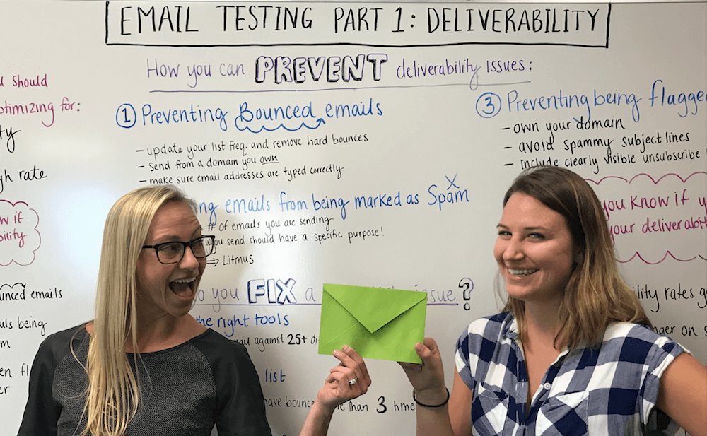
Welcome to Part 3 in our series on Email Testing: Click-through rates. In Part 1 of our series, I covered the top 3 things you should be testing and optimizing:
Deliverability
Open Rates
Click-through Rate
Remember, the order of this list is intentional. If you are having deliverability issues then people don't even have the chance to open your email. And if your emails aren't being opened, then people will never be able to click on what's inside.
In Part 1 we made sure your emails land safely in your recipients inbox and in Part 2 we assured that they were opened. Now it's time to make sure they click on what's inside by testing and optimizing your click-through rates (CTR).

But first...
In order to figure out if your click-through rates are in need of optimization you can compare them to:
Industry average click-through rates
Your company's click-through rates (historically)
According to the latest figures, CTR varies from 4% on the low end to 13.7% on the high end. But it depends on the industry. If you are performing significantly below your industry's standard, that is a good indication that you're in need of improvement.
If you have historical data available, this is always going to be your best source of comparison. Because even within each industry there exists a range of experience, and each company is unique.
Although optimizing click-through rates may not take priority over an aspect of your email strategy that is underperforming, unless your CTR is 100%, there is always room for improvement!
If you have compared your CTR to industry averages and your own historical data and found they are subpar, it's time to get them out of the gutter. But what is the best approach to improving your email click-through rates? You guessed it! Test, test, test.
So, let's get right to it.
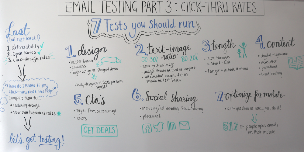
To understand what kind of design will get the most clicks from your audience, you can try tweaking:
In our experience, overly designed emails perform worse, particularly in B2B. Instead, emails that look like they could have been sent from a real person, like a friend or colleague, are preferred. We have also found that sticking to a format that people are familiar with is best. A good format to follow for a stripped down email from top to bottom is:
Logo
Greeting
Email copy, including one in-text call to action
CTA button (reiterating the in-text call to action)
Signature
Social share buttons
Unsubscribe link
By sticking to a formula recipients are familiar with you eliminate confusion and keep the focus where you want it: on your call-to-action.
You can run tests around the percentage of text versus images in your emails (i.e., 80-20%, 50-50%, etc). However, your emails should never be composed solely of an image. Why? Any recipient that receives the rich-text version of this email (which happens for a multitude of reasons) will see absolutely nothing when they open your email.
As a rule, images should support the text of your email, not the other way around. All essential email content and CTA's should be text-based. What we’ve learned from our testing is that emails with a higher ratio of text to images perform better in terms of click-through rates. But, as with everything on this list - you need to test this aspect on your own audience to determine what they prefer.
To determine the length of email you audience prefers try testing:
From our testing, if your goal is for people to click-though then keep them on the short side. And if you have longer digests, include menu items at top that summarize the longer content that follows. For those with short attention spans or short on time, the menu may be all they need to decide to click. Those who are more inquisitive or have additional time on their hands they can scroll through and read it all before deciding to click. Either way, you have satisfied the needs of these two types of recipients.
You can also try switching up your email content. For example, try sending:
People love a good discount and using email to share your promotions absolutely works. However, promotion after promotion after promotion can fatigue consumers, even n B2C. You should also utilize email to build your brand - share who you are, what your doing, and why you do it. This content is especially important to share if your company is new. What we have found is that a mixture of email types leads to higher conversions when it matters.
When it comes to CTA's you can test:
We usually include two different types of CTAs in each email (i.e., one text link and one button). Some people might like links, whereas others might like buttons. You can also have images serve as CTAs.
In our experience, you should include not more than 3 CTAs total in each email, except in the case of longer, newsletter type emails. Giving people too many options just leads to decision paralysis or makes people confused, “where should I go?”
When it comes to colors for your CTA's the only hard and fast rule is do not use the color red. Psychologically red tells someone stop, this is dangerous! Not exactly the message you want to send. Otherwise, just make sure the color stands out from the rest of your design, then test, test, test.
Including social sharing links is a great way to get your content out to a wider audience. However, if they distract users from following through on your primary call-to-action then we want to remove them. The only way to know is to test it.
Try:
What we found is these are not the highest clicked buttons, and they shouldn’t be. However, we have found lots of people do actually click on these. It also gives those people who are not interested in your offer at the moment an option to take action by sharing it with someone who might be. In this respect, these buttons function as a free lead generator.
This is not really a test - just do it. This is actually the very first thing you should do before running any of the tests above. Nowadays, 51% of people open emails on their mobile phone. If your email is not optimized for mobile, you have already lost half of your potential clicks!
That concludes our series. Now, you're all set to test and optimize your emails for deliverability, opens and clicks!
If you are looking for ways to build your email subscriber list, check out our Introduction to Lead Generation Guide.
This blog is part of "Your Definitive Guide to Conversion Rate Optimization" blog series and "Your Definitive Guide to Lead Nurturing" blog series.

As I was listening to the Marketing Smarts podcast this week, the guest speaker, Nancy Harhut shared tactics based on the field of decision science (...

There are over 270 Billion emails sent every single day (Radicati Group). And that brings us to the purpose of this video series: to help you make...

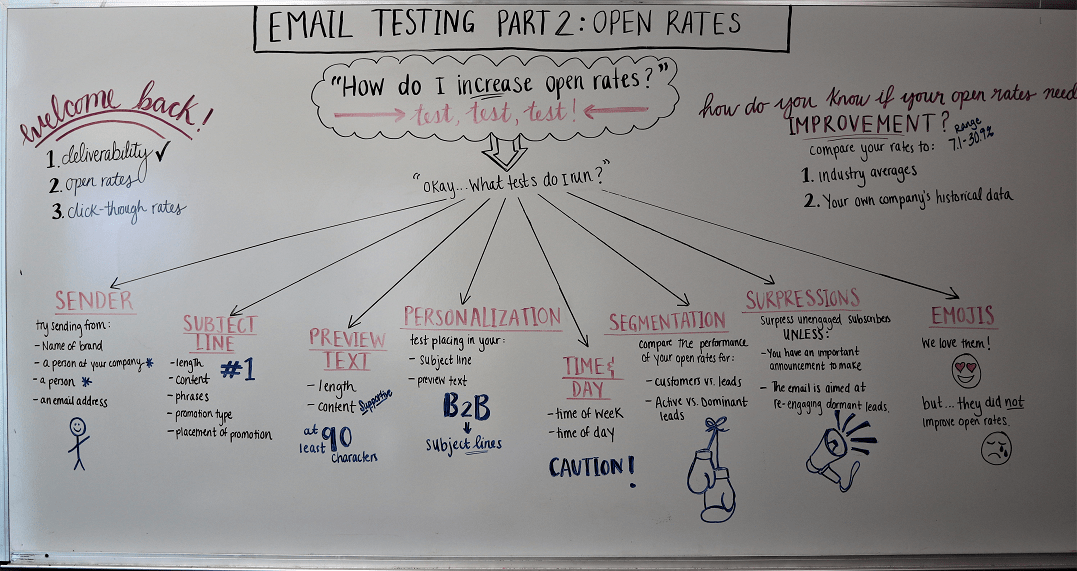
Welcome to Part 2 in our series on Email Testing. In Part 1 of our series, we covered the top 3 things you should be testing and optimizing: