



Marketing Conversion: 10 Strategies to Increase Conversion Rates
Marketing conversion has become more important as digital competition increases and customer attention spans continue to shrink. Research shows the...
A HubSpot Elite Solutions Partner built to help organizations unify strategy, systems, and execution. We design HubSpot systems that scale.
See how we've solved complex HubSpot challenges across migrations, integrations, CMS, automation, and optimization.
Join a team building smarter HubSpot systems. We value strategic thinkers who move proactively, care about quality, and want to do meaningful work.
Free assessments, knowledge, and expert content for your HubSpot.
A landing page can attract thousands of visitors, but if only a small percentage take action, much of your marketing investment goes to waste. Improving your conversion rate helps you get more leads and sales from the traffic you already have.
According to Think with Google, increasing the number of page elements from 400 to 6,000 can reduce the probability of conversion by as much as 95%. Clear messaging, focused design, and a friction-free experience make it easier for visitors to take the next step.
This guide covers what a good landing page conversion rate looks like, the factors that affect performance, and 12 proven ways to increase conversions.
A good landing page conversion rate varies based on your industry, audience, offer, traffic source, and conversion goal. Compare your performance to industry benchmarks and optimize based on your business goals.
Recent benchmark data from more than 41,000 landing pages, 464 million visitors, and 57 million conversions found:
|
Conversion Rate |
Performance |
|
Below 3% |
Needs improvement |
|
3%–6% |
Average |
|
Around 6.6% |
Current median across industries |
|
10%+ |
Strong performance |
|
15%+ |
Exceptional, depending on industry and offer |
The current median landing page conversion rate is 6.6%. However, a good conversion rate varies by context. A landing page promoting a free ebook may convert at over 20%, while a page asking visitors to schedule a product demo or purchase an expensive B2B solution may convert at a much lower rate and still perform well.
Tip: Testing headlines, simplifying forms, strengthening your value proposition, improving page speed, and refining your call to action are often the fastest ways to increase conversions.
Visitors decide within a few seconds whether your landing page matches what they clicked. If your headline or offer doesn't align with the ad, email, or search result that brought them there, many will leave before reading the rest of the page.
To keep visitors engaged:
A generic headline like "Business Growth Solutions" doesn't clearly connect to the promise made in a Google ad offering a Free CRM Migration Assessment. A more effective approach is to match the landing page headline to the ad, such as "Get Your Free CRM Migration Assessment from Certified HubSpot Experts."
Message matching helps reinforce that visitors are in the right place, reducing confusion and improving engagement.
The first screen should answer your visitor's biggest questions before they scroll:
Build your hero section with these elements:
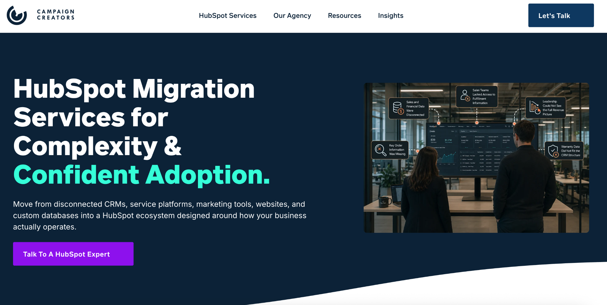
Take a look at how we created our HubSpot Migration landing page. The headline immediately communicates the offer, and the CTA makes the next step clear.

Avoid filling the hero section with multiple promotions or long paragraphs. Visitors should understand your offer without scrolling or piecing information together.
Every landing page should guide visitors toward one action. Giving people multiple choices often creates decision fatigue and lowers conversion rates.
Choose one primary goal, such as book a demo, start a free trial, download a guide, or request a quote. Then support that goal throughout the page by:
When visitors are ready to convert, they shouldn't have to search for the next step or choose between multiple actions.
Visitors don't buy features. They buy the outcomes those features help them achieve. Your copy should explain how your product or service solves a problem or improves results.
A simple formula is: Feature → Benefit → Business outcome
For example:
|
Feature |
Benefit |
Business Outcome |
|
AI Reporting |
Generates reports automatically |
Save hours of manual reporting every week |
|
CRM Integration |
Syncs customer data across tools |
Reduce duplicate records and data entry |
|
Workflow Automation |
Automates repetitive tasks |
Give your team more time to focus on revenue-generating work |
Keep paragraphs short and use bullet points to make benefits easy to scan. Each section should help visitors answer one question: "How will this help me?"
Your form is where many conversions are won or lost. Every additional field increases the effort required to convert, so only ask for information you need at that stage of the customer journey.
A good starting point is:
|
Offer |
Recommended Fields |
|
Newsletter |
|
|
Ebook or Checklist |
Name, Email |
|
Webinar Registration |
Name, Email, Company |
|
Demo Request |
Name, Email, Company, Phone (if needed) |
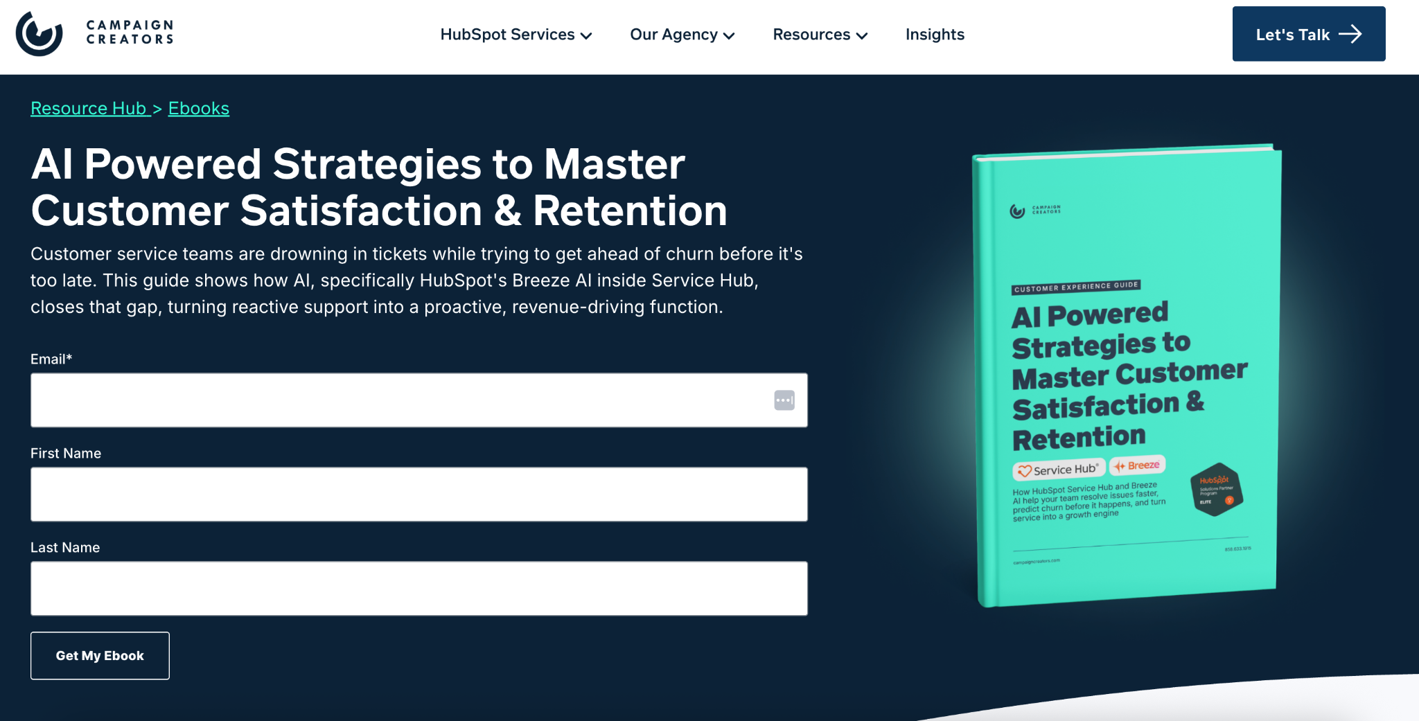
Here's an example from our HubSpot ebook landing page for AI-Powered Strategies to Master Customer Satisfaction & Retention. Notice that we only ask for a visitor's name and email because that's all we need to deliver the ebook.

Keeping the form short reduces friction, making it easier for visitors to complete and increasing the likelihood that they'll convert.
You can also improve form completion by:
Every improvement should make the form feel faster and easier to complete.
Most visitors won't convert until they feel confident in your business. Trust signals work best when they're placed at the moment visitors are deciding whether to click your CTA or submit a form.
Include evidence such as:
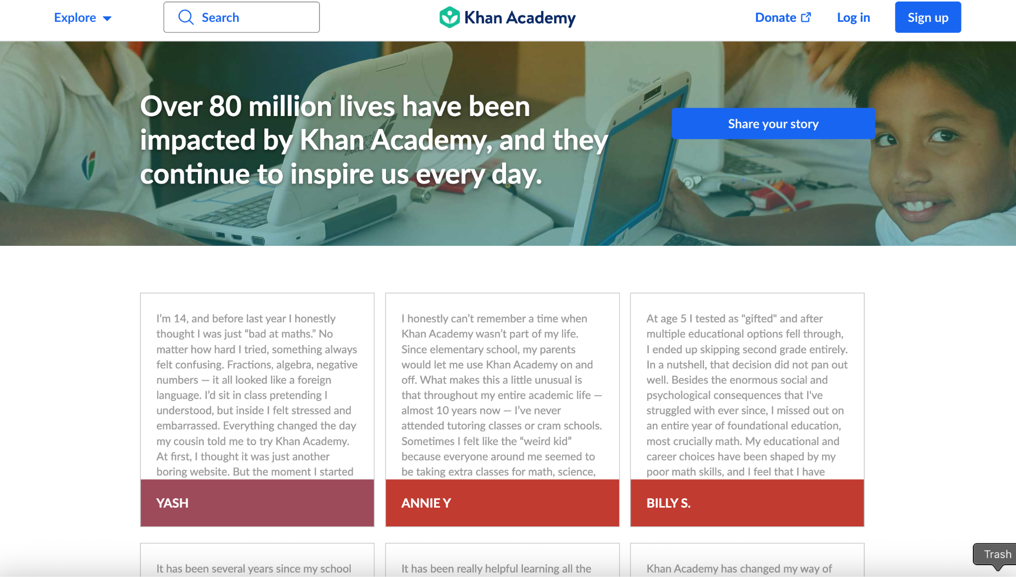
Place your strongest trust signals where they have the greatest impact on a visitor's decision. Display them directly below the hero section to reinforce your value proposition, beside or immediately below your form to build confidence before submission, and just above your final CTA to help address any last-minute hesitation before visitors convert. Here is an example from Khan Academy:

Specific results are far more convincing than broad praise because they help visitors picture the outcome they could achieve.
Visitors understand your offer faster when they can see it. Use visuals to demonstrate how your product works, what your service delivers, or what customers can expect after converting. Every image or video should answer a question or reinforce your message.
Choose visuals that support your offer, such as:
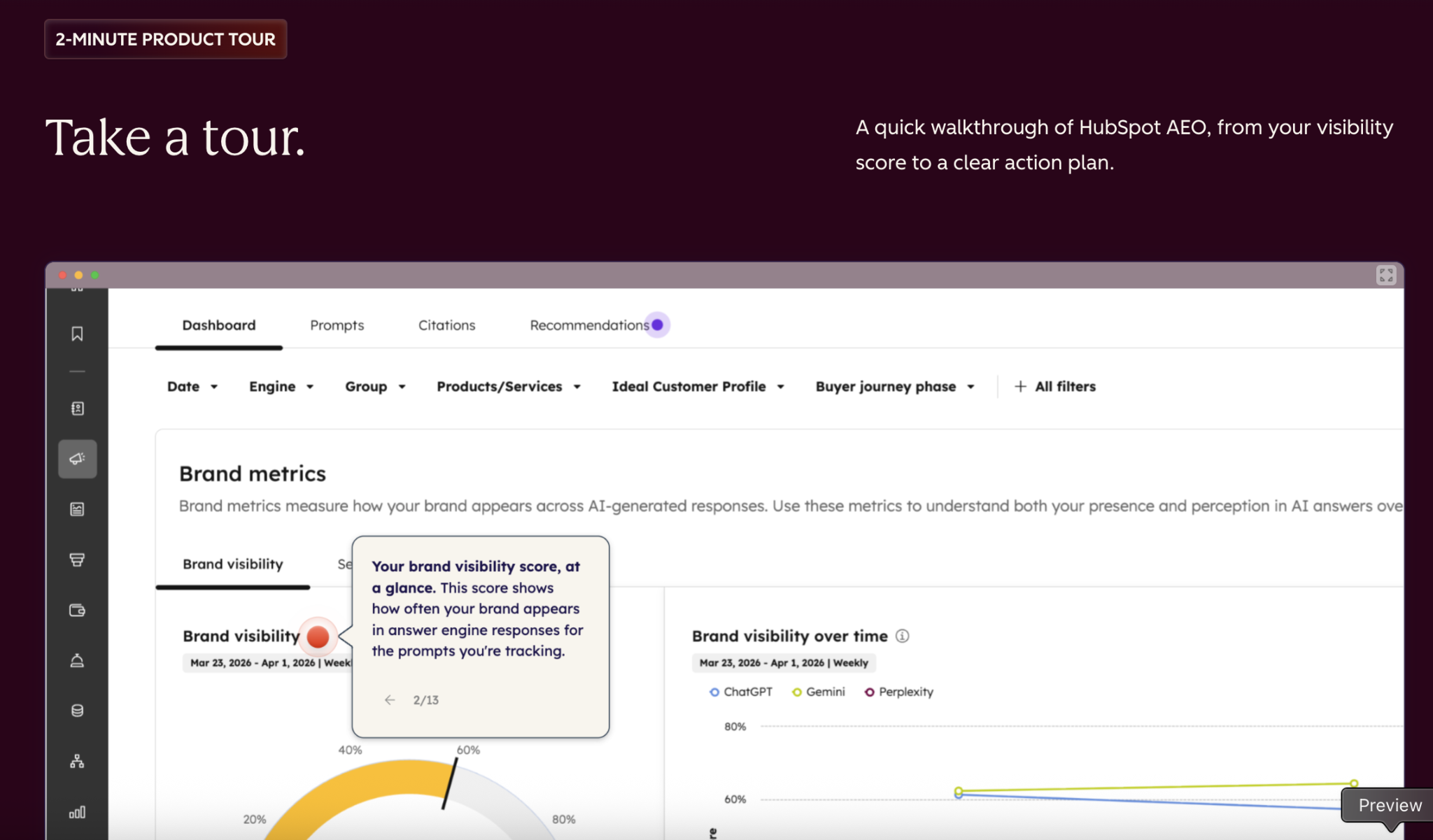
HubSpot is a great example of using visuals effectively. Because the platform includes many features, its landing pages use a combination of product screenshots, illustrations, and interactive demos to help visitors understand what each feature does without relying on lengthy explanations.

When it comes to placement, position your primary visual beside your headline in the hero section to immediately reinforce your value proposition. Then, use additional visuals throughout the page to highlight key benefits, demonstrate features, or explain more complex concepts.
Every extra link, banner, or promotion competes for your visitor's attention. A landing page should keep visitors focused on completing one action from the moment they arrive until they convert.
Review your page and remove anything that doesn't help visitors reach your conversion goal, including:
Also check your visual hierarchy:
Reducing cognitive load helps visitors make decisions more easily. Studies on choice overload show that increasing decision complexity makes people more likely to postpone or avoid choosing altogether.
Since a large share of visitors arrive on their phones, your mobile experience should make it just as easy to convert. Before publishing, test your page on multiple screen sizes and check that visitors can:
You can also test mobile-specific improvements, such as:
These changes make it easier for mobile visitors to convert without unnecessary effort.
A slow page gives visitors more opportunities to leave before they even evaluate your offer. Improving load speed creates a smoother experience and helps keep visitors engaged.
Start with these improvements:
After making changes, test your page with Google PageSpeed Insights or another performance tool and continue improving any Core Web Vitals issues that affect loading speed or responsiveness.
Your landing page should answer the most common questions before asking them to complete your form or click your CTA. Add sections that address questions such as:
A simple FAQ section works well near the bottom of the page, just above your final CTA.

This placement removes last-minute objections when visitors are deciding whether to convert.
The highest-converting landing pages are built through continuous testing. Start by testing elements that have the biggest influence on visitor decisions:
For each test:
Small improvements made consistently often produce bigger long-term gains than a complete redesign based on assumptions. Use analytics, heatmaps, and session recordings alongside A/B testing to understand where visitors drop off and which changes lead to more conversions.
A landing page should focus on one conversion objective, such as downloading a guide, booking a demo, or making a purchase. Including multiple CTAs, navigation options, or competing offers divides attention and reduces the likelihood of completing any one action.
Visitors decide within seconds whether your offer is relevant. If your headline is vague, feature-focused, or fails to communicate the benefit, many users will leave before reading further. Clearly explain what you offer, who it's for, and the outcome visitors can expect.
Long or complicated forms create unnecessary friction. Request only the information needed for the next step in the customer journey. Shorter forms generally improve completion rates, especially for top-of-funnel offers.
Slow-loading pages and poor mobile usability increase bounce rates before visitors even engage with your content. Optimize images, reduce unnecessary scripts, and ensure buttons, forms, and layouts work well on smaller screens.
Visitors are less likely to convert if they don't trust your business. Missing testimonials, customer reviews, client logos, guarantees, or security badges can create uncertainty, especially for first-time visitors. Social proof and credibility signals help reduce perceived risk.
Too much text, excessive graphics, pop-ups, and unnecessary navigation compete for attention. A clean layout with a clear visual hierarchy helps visitors focus on your message and CTA instead of deciding where to look next.
Start by measuring the metrics that reflect your landing page's effectiveness. These include:
For a complete explanation of every metric and what it means, read our full guide.
A/B testing compares two versions of a landing page or a single page element to determine which performs better. Test one variable at a time, such as:
Changing only one element per test makes it easier to attribute performance differences to that specific change. Allow tests to run long enough to collect meaningful data before concluding.
Focus your optimization efforts on the changes that typically have the greatest impact on conversions. Start by clarifying your headline and strengthening your value proposition so visitors immediately understand your offer.
Then, simplify your forms, improve page speed, add trust signals, optimize the experience for mobile devices, and make your primary CTA more prominent to reduce friction and encourage more conversions.
Landing page optimization isn't a one-time project. Visitor behavior, customer expectations, and marketing campaigns evolve, so review performance regularly and continue testing new ideas. Build a continuous optimization process by measuring results, implementing improvements, and validating them through additional testing.
Organizations that treat CRO as an ongoing practice are better positioned to sustain higher conversion rates over time.
Using a combination of these tools below gives you the insights needed to continuously optimize your landing pages and increase conversions.
Landing page builders make it easier to create, publish, and optimize pages without extensive development work. Many include templates, built-in A/B testing, and integrations with CRM and marketing platforms.
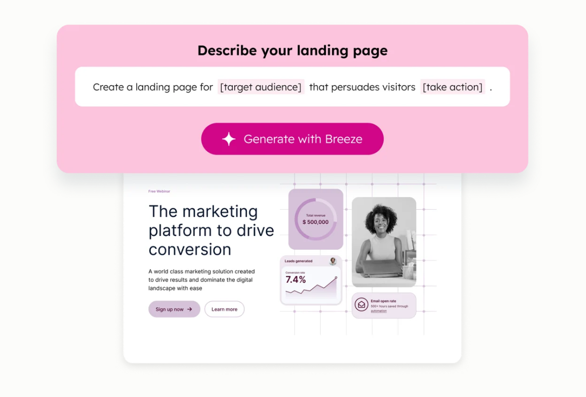
HubSpot combines landing page creation, CRM, marketing automation, and analytics in a single platform. Its drag-and-drop editor and mobile-responsive templates make it easy to build pages without coding, while CRM-powered personalization lets you tailor content based on visitor data. You can also use Breeze AI to generate landing page copy to create pages faster and refine messaging without starting from scratch.

You can also test different page variations, monitor conversion performance, and automatically send new leads into your sales and marketing workflows.
Identify where visitors hesitate or leave your landing page so you can reduce friction and increase conversions.
Testing different versions of your landing page helps determine which elements drive higher conversions.
A fast, discoverable landing page attracts more qualified visitors and delivers a better user experience.
|
Goal |
Recommended Tools |
|
Build landing pages |
HubSpot |
|
Measure performance |
Google Analytics 4, Google Search Console |
|
Understand visitor behavior |
Hotjar, Microsoft Clarity |
|
Run A/B tests |
VWO, Optimizely, AB Tasty |
|
Improve SEO and speed |
Ahrefs, Google PageSpeed Insights |
The most effective landing page optimization strategy combines a landing page builder, analytics platform, behavior analysis tool, and experimentation software. Together, these tools help you identify opportunities and continuously increase conversion rates.
A high-converting landing page does more than look good. It gives visitors a clear reason to take action, removes unnecessary friction, and supports every decision with relevant content, trust signals, and a focused call to action.
If your organization needs higher conversion rates without increasing ad spend, focus on a structured optimization process. Review page performance, identify where visitors drop off, test one improvement at a time, and measure the impact to build sustainable growth.
Campaign Creators help organizations build and optimize landing pages that support measurable business outcomes. From conversion-focused strategy and page design to testing and ongoing optimization, our team helps you turn more visitors into qualified leads and customers.
A landing page is designed for a single campaign or offer with one conversion goal, while a homepage serves as the main entry point to your website and includes multiple navigation options.
Use one primary call to action throughout the page. You can repeat the same CTA in multiple sections, but avoid promoting different actions.
Yes. Creating a dedicated landing page for each campaign keeps your messaging consistent and improves the likelihood of conversions.
Message match means the landing page headline, offer, and content align with the ad, email, or search result that brought visitors to the page.
There isn't one universally best color. The button should stand out from the rest of the page but still aligned with your branding and provide sufficient contrast for visibility.
Use only the fields necessary to complete the conversion. Shorter forms generally reduce friction and increase completion rates.
Marketing conversion has become more important as digital competition increases and customer attention spans continue to shrink. Research shows the...
Your homepage acts as your brand’s digital front door. It is the first interaction that shapes how visitors perceive your business.
Every modern digital business depends on two connected systems: a Customer Relationship Management (CRM) platform and a Content Management System...