 Campaign Creators
Ecommerce Online Ads: 10 Proven Strategies to Increase Sales
E-commerce continues to scale at a rapid pace, with global online revenue projected to reach $6.88 trillion. That growth creates more opportunity,...
Your homepage acts as your brand’s digital front door. It is the first interaction that shapes how visitors perceive your business.
In most cases, people decide whether to stay or leave within 10 to 20 seconds. That means your homepage doesn’t just introduce your brand, it immediately answers a deeper question: “Am I in the right place?”
If your design, messaging, and layout don’t provide that clarity right away, visitors won’t explore further. They leave, and your conversion opportunities disappear with them.
A high-performing homepage balances three things at once:
When these work together, your homepage stops being just a landing point and starts guiding visitors into your revenue funnel.
The job interview analogy still applies, but it helps to look at it through a revenue lens. When someone lands on your homepage, they are quickly trying to understand a few key things:
A homepage that does not answer these questions within a few seconds will result in users leaving, and your acquisition costs will increase. Just like in an interview, clarity, confidence, and relevance lead to better outcomes.

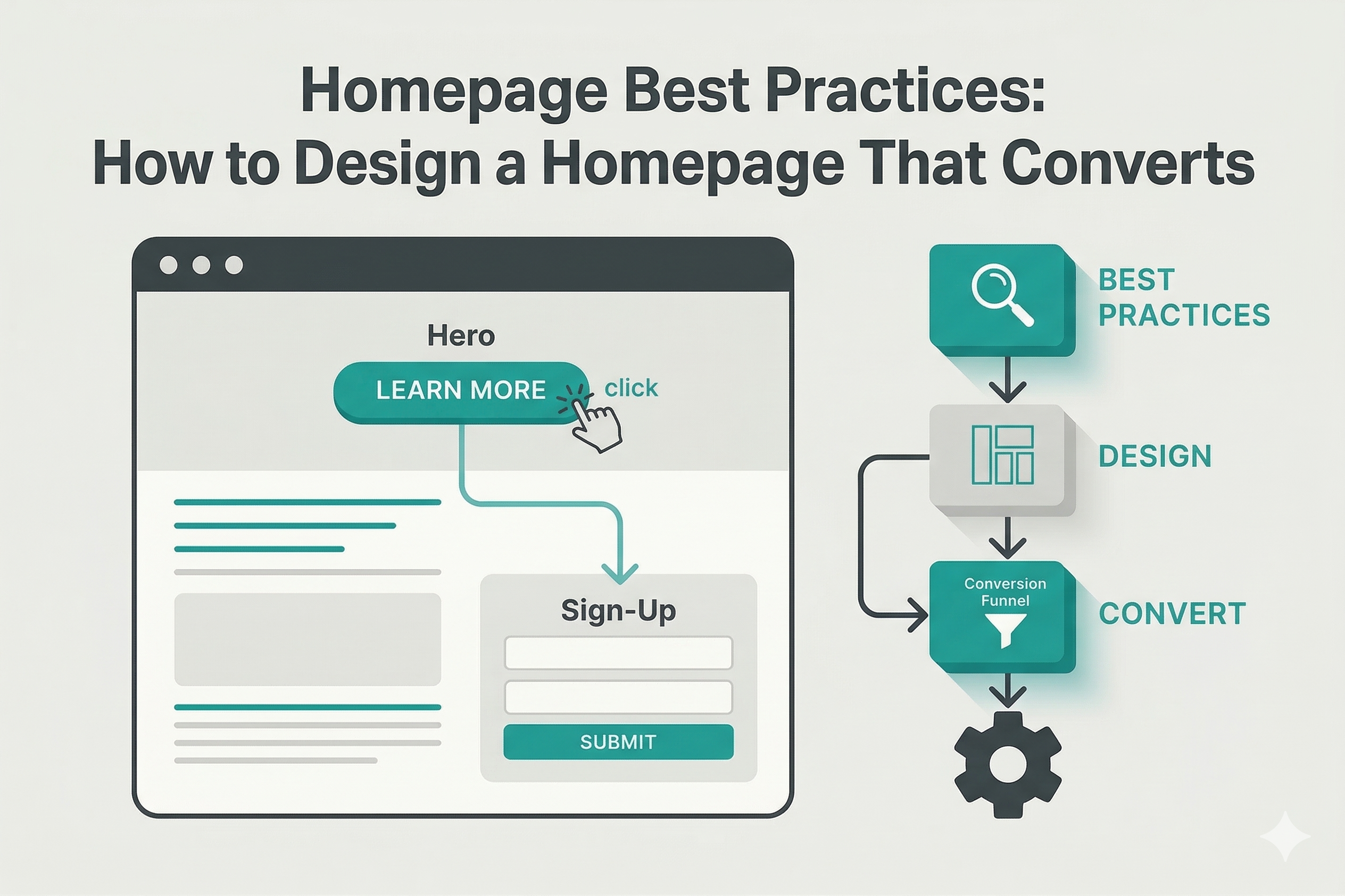
The above-the-fold section is your most valuable space. It’s the first thing visitors see and often the only chance you get to keep them engaged.
A strong structure includes:
A vague, overly clever, or generic section makes visitors lose interest. They don’t try to figure it out. They simply leave.
Your headline is the first line people read, so it needs to communicate value immediately without making the visitor think.
A strong headline should:
If someone clicks through expecting a solution to a specific problem, your headline should confirm they are in the right place within seconds.
A subheadline then builds on that first impression. It adds context and helps the visitor understand how you deliver that outcome and who it is for.
A strong subheadline should:
Practical example: Let’s say you run a B2B marketing agency.
Weak Version
Headline: “We Help Businesses Grow”
Subheadline: “Full-service marketing solutions for modern companies.”
This is too broad and could apply to almost any agency. It does not tell the visitor why they should care.
Strong Version
Headline: “Generate Qualified B2B Leads Without Wasting Ad Spend”
Subheadline: “We help SaaS and service companies turn paid traffic into a sales-ready pipeline through conversion-focused campaigns.”
In the stronger version, you immediately understand:
Visitors do not have to figure out your value when your headline and subheadline work together like this. They see it right away and are more likely to keep exploring.
A new visitor should not have to think about where to click, and your internal team should be confident that each menu item supports how people actually explore and make decisions.
Keep your structure focused and easy to follow:
The navigation should feel intuitive the moment someone lands on your site.
Strong CTAs reduce uncertainty and make the next move feel straightforward and valuable. They should:
Clear, visible, and well-placed CTAs help visitors move forward with confidence and reduce drop-off across the page.

In B2B and complex buying environments, trust plays a direct role in whether a visitor takes action. Clear proof of results and credibility helps reduce hesitation and supports decision-making.
Your homepage should include:
Placement matters just as much as content. Social proof should appear near CTAs and key decision points so it supports action at the right moment, not hidden at the bottom of the page.
Most website traffic now comes from mobile devices, with around 65% recorded in 2025, so your homepage needs to perform seamlessly on smaller screens.
Focus on:
To improve performance:
Strong performance supports a smoother user experience and increases the likelihood that visitors stay engaged and take action.
Visitors do not read your homepage line by line. They scan for signals that help them understand your message quickly.
Use these principles:
A well-structured hierarchy makes your message easy to follow and helps visitors quickly understand what matters most.
For a deeper look at how to drive conversions, you may learn more in this guide: CRO Marketing Hacks to Skyrocket Your ROI.

Slack shows its value the moment you land on the page. You immediately see that it helps teams communicate, and the product interface beside the headline makes that clear right away. The message, visual, and CTA work together on one screen, so you understand what to do next without thinking. This helps more visitors move straight into signing up.

Notion uses a clean and simple layout that makes everything easy to follow. Each section focuses on one idea, and the spacing helps you move through the page without effort. You can see examples of how the product works, and each part builds your understanding step by step. This homepage keeps you engaged and helps you stay on the page longer.

Netflix places its call to action right at the center of the page. A simple message and an email field that lets you start immediately. The design removes extra steps, so you can move forward without delay. The same action appears again across the page, which keeps the path clear. This can increase sign-ups because the next step always feels easy.

Airbnb builds trust early through ratings, reviews, and real listings. You can see the proof from other users right away. The visuals and feedback from guests and hosts show real experiences, which help you feel more confident.

HubSpot connects its homepage with the rest of its marketing and sales journey. The messaging matches what you see in ads and content, so the experience feels consistent. The layout supports different paths, such as starting for free or booking a demo. Each step leads naturally into the next stage. This alignment helps turn visitors into leads and supports longer buying decisions.
All of these homepages follow a simple pattern. You immediately understand the value right away, you see proof early, and you are guided toward a clear next step. This helps turn visitors into users or customers because every part of the page supports a clear action.
Start by tracking how visitors interact with your page. Look at where they click, how far they scroll, and where they drop off. This helps you understand which sections are working and which ones create friction.
Test key elements that directly impact conversions. Focus on:
Run simple A/B tests to compare variations and identify what leads to more engagement or conversions.
Use tools such as heatmaps and session recordings to see how users actually navigate your page. This often reveals issues that analytics alone cannot show, such as confusion, hesitation, or missed CTAs.
Pay attention to performance metrics that tie to real outcomes, such as:
Small improvements compound as you continue testing and refining. Your homepage becomes more aligned with your audience, clearer in its messaging, and more effective at turning visitors into leads.
Use this as a quick way to spot what might be slowing people down, where small moments of hesitation turn into lost conversions.
Any friction, even minor, lowers conversions and drives up acquisition costs. As these issues build, they reveal a deeper optimization gap that needs a more structured approach. Here are 9 signs you need a conversion rate optimization agency.
A homepage that doesn’t convert points to unclear messaging, weak structure, or no clear next step. These gaps create friction that causes visitors to hesitate or leave before taking action.
Our CRO services identify exactly where that friction happens and refine your messaging, layout, and conversion paths into a focused experience that guides users from first impression to action.
Start turning your homepage into a consistent source of leads!
E-commerce continues to scale at a rapid pace, with global online revenue projected to reach $6.88 trillion. That growth creates more opportunity,...
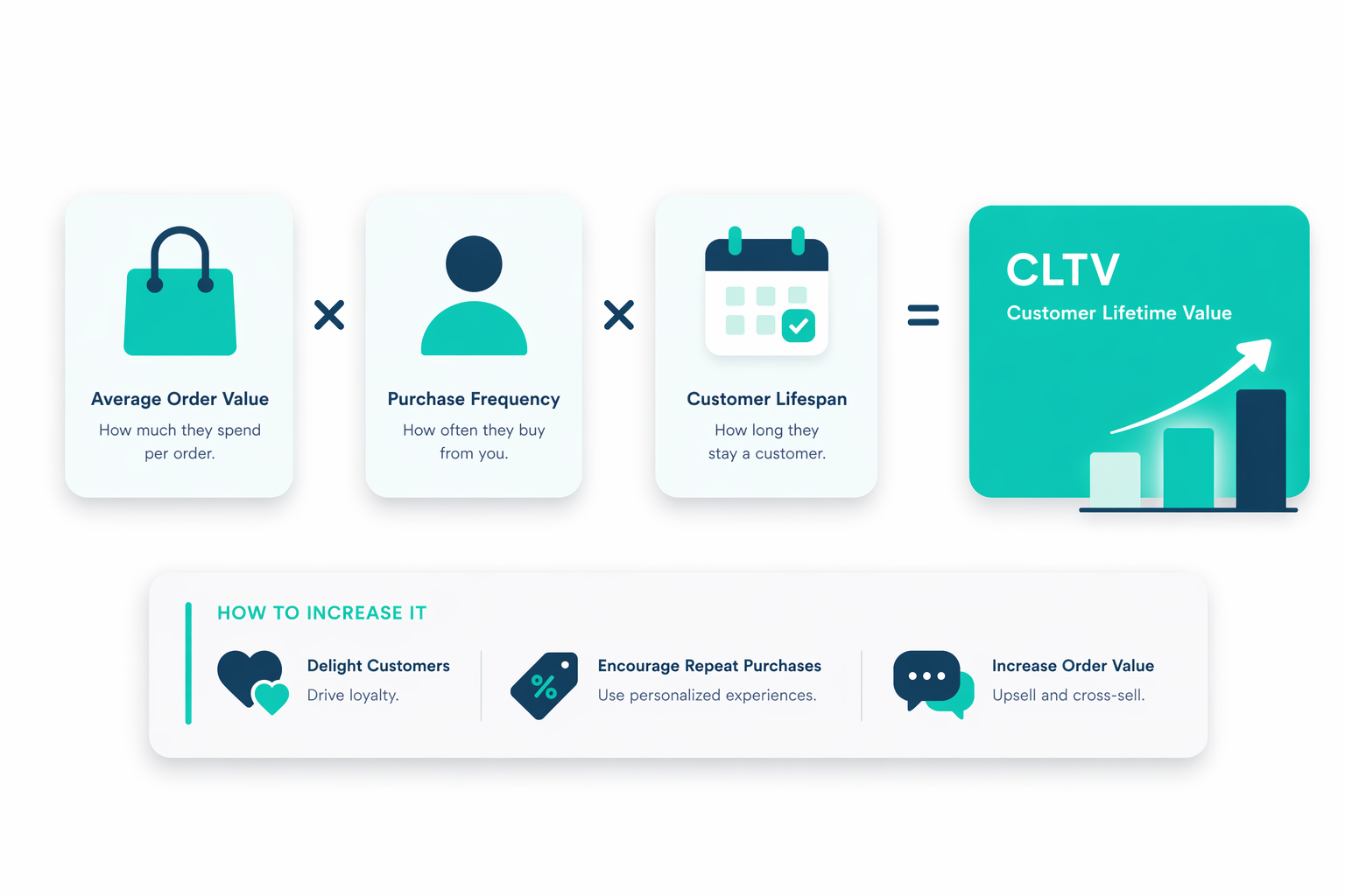
Customer Lifetime Value (CLTV) shifts your focus from one-off sales to the full value each customer brings over time. Instead of relying on single...
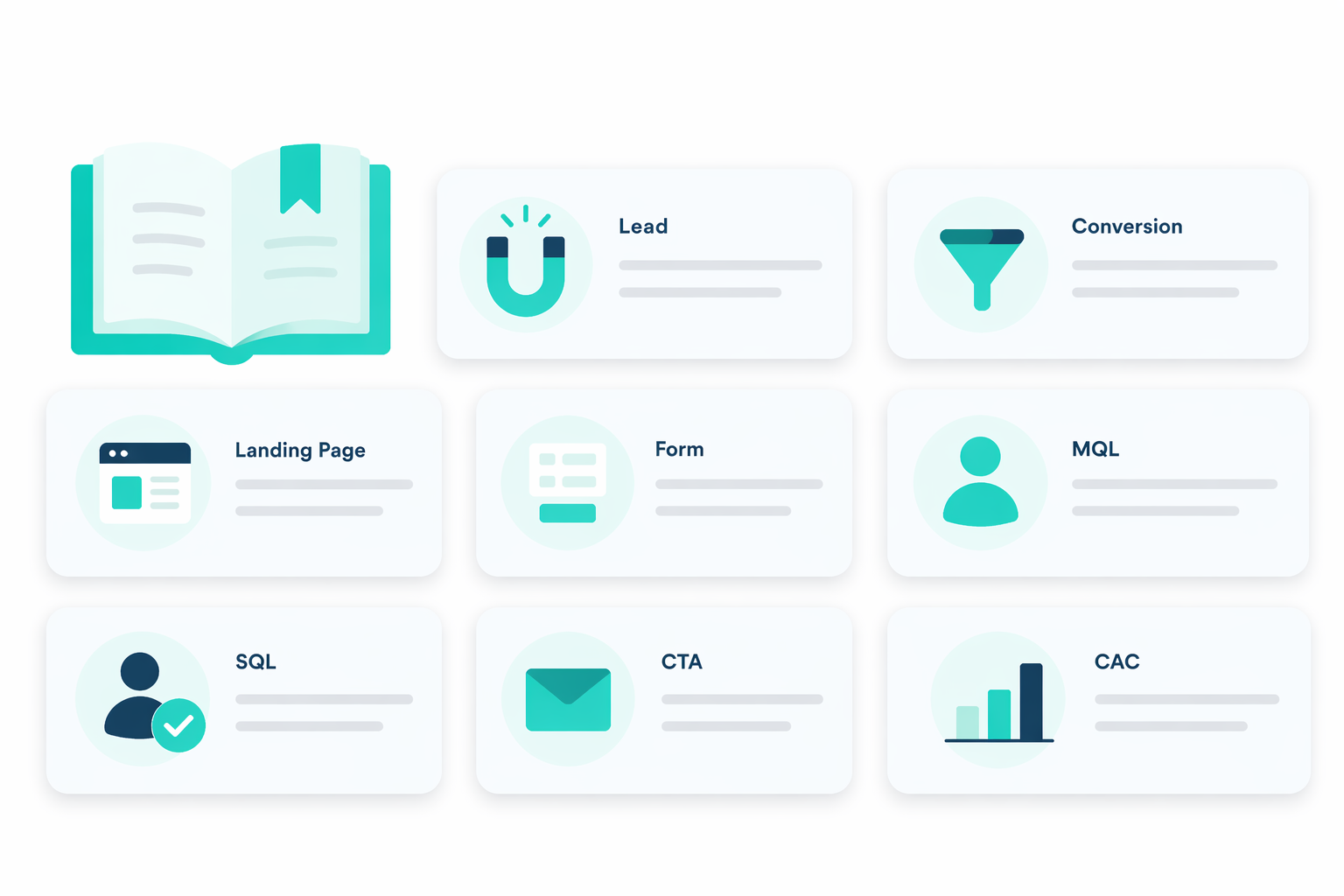
Marketing is full of terms that sound similar but mean different things. “Leads,” “prospects,” “MQLs,” “SQLs,” “funnels,” and “pipelines” get used...